The skip-ui framework is available at https://github.com/skiptools/skip-ui.git, which can be checked out and tested with skip test once Skip is installed.
SkipUI
- About SkipUI
- Dependencies
- Status
- Contributing
- Implementation Strategy
- ComposeView
- composeModifier
- Tests
- Supported SwiftUI
- Supported UIKit
- Topics
SwiftUI support for Skip apps.
About SkipUI
SkipUI vends the skip.ui Kotlin package. It is a reimplementation of SwiftUI for Kotlin on Android using Jetpack Compose. Its goal is to mirror as much of SwiftUI as possible, allowing Skip developers to use SwiftUI with confidence.

Dependencies
SkipUI depends on the skip transpiler plugin. The transpiler must transpile SkipUI’s own source code, and SkipUI relies on the transpiler’s transformation of SwiftUI code. See Implementation Strategy for details. SkipUI also depends on the SkipFoundation and SkipModel packages.
SkipUI is part of the core SkipStack and is not intended to be imported directly.
The module is transparently adopted through the translation of import SwiftUI into import skip.ui.* by the Skip transpiler.
Android Libraries
- SkipUI adds an Android dependency on Coil to implement
AsyncImage. - SkipUI includes source code from the ComposeReorderable project to implement drag-to-reorder in
Lists.
Status
SkipUI - together with the Skip transpiler - has robust support for the building blocks of SwiftUI, including its state flow and declarative syntax. SkipUI also implements many of SwiftUI’s basic layout and control views, as well as many core modifiers. It is possible to write an Android app entirely in SwiftUI utilizing SkipUI’s current component set.
SkipUI is a young library, however, and much of SwiftUI’s vast surface area is not yet implemented. You are likely to run into limitations while writing real-world apps. See Supported SwiftUI for a full list of supported components and constructs.
When you want to use a SwiftUI construct that has not been implemented, you have options. You can try to find a workaround using only supported components, embed Compose code directly, or add support to SkipUI. If you choose to enhance SkipUI itself, please consider contributing your code back for inclusion in the official release.
Contributing
We welcome contributions to SkipUI. The Skip product documentation includes helpful instructions and tips on local Skip library development.
The most pressing need is to implement more core components and view modifiers. View modifiers in particular are a ripe source of low-hanging fruit. The Compose Modifier type often has built-in functions that replicate SwiftUI modifiers, making these SwiftUI modifiers easy to implement.
To help fill in unimplemented API in SkipUI:
- Find unimplemented API. Unimplemented API will either be within
#if !SKIPblocks, or will be marked with@available(*, unavailable). Note that most unimplementedViewmodifiers are in theView.swiftsource file. - Write an appropriate Compose implementation. See Implementation Strategy below.
- Write tests and/or showcase code to exercise your component. See Tests.
- Submit a PR.
Other forms of contributions such as test cases, comments, and documentation are also welcome!
Implementation Strategy
Code Transformations
SkipUI does not work in isolation. It depends on transformations the skip transpiler plugin makes to SwiftUI code. And while Skip generally strives to write Kotlin that is similar to hand-crafted code, these SwiftUI transformations are not something you’d want to write yourself. Before discussing SkipUI’s implementation, let’s explore them.
Both SwiftUI and Compose are declarative UI frameworks. Both have mechanisms to track state and automatically re-render when state changes. SwiftUI models user interface elements with View objects, however, while Compose models them with @Composable functions. The Skip transpiler must therefore translate your code defining a View graph into @Composable function calls. This involves two primary transformations:
- The transpiler inserts code to sync
Viewmembers that have special meanings in SwiftUI -@State,@EnvironmentObject, etc - with the corresponding Compose state mechanisms, which are not member-based. The syncing goes two ways, so that yourViewmembers are populated from Compose’s state values, and changing yourViewmembers updates Compose’s state values. - The transpiler turns
@ViewBuilders- includingView.body- into@Composablefunction calls.
The second transformation in particular deserves some explanation, because it may help you to understand SkipUI’s internal API. Consider the following simple example:
struct V: View {
    let isHello: Bool

    var body: some View {
        if isHello {
            Text("Hello!")
        } else {
            Text("Goodbye!")
        }
    }
}
The transpilation would look something like the following:
class V: View {
    val isHello: Bool

    constructor(isHello: Bool) {
        this.isHello = isHello
    }

    override fun body(): View {
        return ComposeBuilder { composectx ->
            if (isHello) {
                Text("Hello!").Compose(context = composectx)
            } else {
                Text("Goodbye!").Compose(context = composectx)
            }
            ComposeResult.ok
        }
    }

    ...
}
Notice the changes to the body content. Rather than returning an arbitrary view tree, the transpiled body always returns a single ComposeBuilder, a special SkipUI view type that invokes a @Composable block. The logic of the original body is now within that block, and any View that body would have returned instead invokes its own Compose(context:) function to render the corresponding Compose component. The Compose(context:) function is part of SkipUI’s View API.
Thus the transpiler is able to turn any View.body - actually any @ViewBuilder - into a ComposeBuilder: a block of Compose code that it can invoke to render the desired content. A later section details how you can use SkipUI’s ComposeView yourself to move fluidly between SwiftUI and Compose when writing your Android UI.
Implementation Phases
SkipUI contains stubs for the entire SwiftUI framework. API generally goes through three phases:
- Code that no one has begun to port to Skip starts in
#if !SKIPblocks. This hides it from the Skip transpiler. - The first implementation step is to move code out of
#if !SKIPblocks so that it will be transpiled. This is helpful on its own, even if you just mark the API@available(*, unavailable)because you are not ready to implement it for Compose. Anunavailableattribute will provide Skip users with a clear error message, rather than relying on the Kotlin compiler to complain about unfound API.- When moving code out of a
#if !SKIPblock, please strip Apple’s extensive API comments. There is no reason for Skip to duplicate the official SwiftUI documentation, and it obscures any Skip-specific implementation comments we may add. - SwiftUI uses complex generics extensively, and the generics systems of Swift and Kotlin have significant differences. You may have to replace some generics or generic constraints with looser typing in order to transpile successfully. Typing will still be enforced in user code by the Swift compiler.
- Reducing the number of Swift extensions and instead folding API into the primary declaration of a type can make Skip’s internal symbol storage more efficient. You should, however, leave
Viewmodifiers that are specific to a given component - e.g..navigationTitleis specific toNavigationStack- within the component’s source file.
- When moving code out of a
- Finally, we add a Compose implementation and remove any
unavailableattribute.
Note that SkipUI should remain buildable throughout this process. Being able to successfully compile SkipUI in Xcode helps us validate that our ported components still mesh with the rest of the framework.
Components
Before implementing a component, familiarize yourself with SkipUI’s View protocol in Sources/View/View.swift as well as the files in the Sources/Compose directory. It is also helpful to browse the source code for components and modifiers that have already been ported. See the table of Supported SwiftUI.
The Text view exemplifies a typical SwiftUI component implementation. Here is an abbreviated code sample:
public struct Text: View, Equatable, Sendable {
    let text: String

    public init(_ text: String) {
        self.text = text
    }

    ...

    #if SKIP
    @Composable public override func ComposeContent(context: ComposeContext) {
        let modifier = context.modifier
        let font = EnvironmentValues.shared.font ?? Font(fontImpl: { LocalTextStyle.current })
        ...
        androidx.compose.material3.Text(text: text, modifier: modifier, style: font.fontImpl(), ...)
    }
    #else
    public var body: some View {
        stubView()
    }
    #endif
}
As you can see, the Text type is defined just as it is in SwiftUI. We then use an #if SKIP block to implement the composable View.ComposeContent function for Android, while we stub the body var to satisfy the Swift compiler. ComposeContent makes the necessary Compose calls to render the component, applying the modifier from the given context as well as any applicable environment values. If Text had any child views, ComposeContent would call child.Compose(context: context.content()) to compose its child content. (Note that View.Compose(context:) delegates to View.ComposeContent(context:) after performing other bookkeeping operations, which is why we override ComposeContent rather than Compose.)
Modifiers
Modifiers, on the other hand, use the ComposeModifierView to perform actions, including changing the context passed to the modified view. Here is the .opacity modifier:
extension View {
    public func opacity(_ opacity: Double) -> some View {
        #if SKIP
        return ComposeModifierView(targetView: self) { context in
            context.modifier = context.modifier.alpha(Float(opacity))
            return ComposeResult.ok
        }
        #else
        return self
        #endif
    }
}
Some modifiers have their own composition logic. These modifiers use a different ComposeModifierView constructor whose block defines the composition. Here, for example, .frame composes the view within a Compose Box with the proper dimensions and alignment:
extension View {
    public func frame(width: CGFloat? = nil, height: CGFloat? = nil, alignment: Alignment = .center) -> some View {
        #if SKIP
        return ComposeModifierView(contentView: self) { view, context in
            var modifier = context.modifier
            if let width {
                modifier = modifier.width(width.dp)
            }
            if let height {
                modifier = modifier.height(height.dp)
            }
            let contentContext = context.content()
            ComposeContainer(modifier: modifier, fixedWidth: width != nil, fixedHeight: height != nil) { modifier in
                Box(modifier: modifier, contentAlignment: alignment.asComposeAlignment()) {
                    view.Compose(context: contentContext)
                }
            }
        }
        #else
        return self
        #endif
    }
}
Like other SwiftUI components, modifiers use #if SKIP ... #else ... to stub the Swift implementation and keep SkipUI buildable in Xcode.
ComposeView
ComposeView is an Android-only SwiftUI view that you can use to embed Compose code directly into your SwiftUI view tree. In the following example, we use a SwiftUI Text to write “Hello from SwiftUI”, followed by calling the androidx.compose.material3.Text() Compose function to write “Hello from Compose” below it:
VStack {
    Text("Hello from SwiftUI")
    #if SKIP
    ComposeView { _ in
        androidx.compose.material3.Text("Hello from Compose")
    }
    #endif
}
Skip also enhances all SwiftUI views with a Compose() method, allowing you to use SwiftUI views from within Compose. The following example again uses a SwiftUI Text to write “Hello from SwiftUI”, but this time from within a ComposeView:
#if SKIP
ComposeView { context in
    androidx.compose.foundation.layout.Column(modifier: context.modifier) {
        Text("Hello from SwiftUI").Compose(context: context.content())
        androidx.compose.material3.Text("Hello from Compose")
    }
}
#endif
Or:
#if SKIP
ComposeView { context in
    VStack {
        Text("Hello from SwiftUI").Compose(context: context.content())
        androidx.compose.material3.Text("Hello from Compose")
    }.Compose(context: context)
}
#endif
With ComposeView and the Compose() function, you can move fluidly between SwiftUI and Compose code. These techniques work not only with standard SwiftUI and Compose components, but with your own custom SwiftUI views and Compose functions as well.
ComposeView and the Compose() function are only available in Android, so you must guard all uses with the #if SKIP or #if os(Android) compiler directives.
composeModifier
In addition to ComposeView above, Skip offers the composeModifier SwiftUI modifier. This modifier allows you to apply any Compose modifiers to the underlying Compose view. It takes a block that accepts a single androidx.compose.ui.Modifier parameter and returns a Modifier as well. For example:
#if SKIP
import androidx.compose.foundation.layout.imePadding
#endif

...

TextField("Enter username:", text: $username)
    .textFieldStyle(.plain)
    #if SKIP
    .composeModifier { $0.imePadding() }
    #endif
Like ComposeView, the composeModifier function is only available in Android, so you must guard all uses with the #if SKIP or #if os(Android) compiler directives.
Tests
SkipUI utilizes a combination of unit tests, UI tests, and basic snapshot tests in which the snapshots are converted into ASCII art for easy processing.
Perhaps the most common way to test SkipUI’s support for a SwiftUI component, however, is through the Skip Showcase app. Whenever you add or update support for a visible element of SwiftUI, make sure there is a showcase view that exercises the element. This not only gives us a mechanism to test appearance and behavior, but the showcase app becomes a demonstration of supported SwiftUI components on Android over time.
Supported SwiftUI
The following table summarizes SkipUI’s SwiftUI support on Android. Anything not listed here is likely not supported. Note that in your iOS-only code - i.e. code within #if !SKIP blocks - you can use any SwiftUI you want.
Support levels:
- ✅ – Full
- 🟢 – High
- 🟡 – Medium
- 🟠 – Low
| Support | API |
|---|---|
| 🟢 |
|
| ✅ | @Bindable |
| ✅ | @Binding (example) |
| ✅ |
|
| ✅ | @EnvironmentObject (example) |
| ✅ | @ObservedObject (example) |
| ✅ | @State (example) |
| ✅ | @StateObject (example) |
| ✅ | AsyncImage (example) |
| ✅ | Button (example) |
| ✅ | Capsule (example) |
| ✅ | Circle (example) |
| 🟢 |
|
| 🟡 |
|
| ✅ | Divider (example) |
| 🟢 | |
| 🟡 |
|
| ✅ | EmptyView |
| 🟡 |
|
| 🟢 |
|
| ✅ | Form (example) |
| 🟡 |
|
| 🟡 |
|
| ✅ | Group |
| ✅ | HStack (example) |
| 🟢 | |
| 🟢 | |
| 🟡 |
|
| 🟡 |
|
| 🟡 |
|
| 🟡 |
|
| ✅ | LinearGradient (example) |
| ✅ | Link (example) |
| 🟢 | |
| 🟢 | |
| ✅ | Menu (example) |
| 🟢 |
|
| 🟢 |
|
| 🟢 |
|
| ✅ | Oval (example) |
| ✅ | Picker (example) |
| 🟡 |
|
| ✅ | RadialGradient (example) |
| ✅ | Rectangle (example) |
| ✅ | RoundedRectangle (example) |
| ✅ | ScrollView (example) |
| 🟡 |
|
| 🟡 |
|
| 🟢 | |
| ✅ | SecureField (example) |
| 🟠 |
|
| 🟡 |
|
| 🟢 |
|
| 🟠 |
|
| 🟠 |
|
| 🟢 |
|
| 🟢 | |
| 🟢 |
|
| 🟢 |
|
| 🟢 |
|
| 🟡 |
|
| ✅ | ToolbarItem (example) |
| ✅ | ToolbarItemGroup (example) |
| 🟠 |
|
| ✅ | UnevenRoundedRectangle (example) |
| ✅ | Custom Views |
| ✅ | Custom ViewModifiers |
| ✅ | VStack (example) |
| 🟡 |
|
| ✅ | ZStack (example) |
| 🟢 |
|
| ✅ | .accessibilityHeading |
| ✅ | .accessibilityHidden |
| ✅ | .accessibilityIdentifier |
| ✅ | .accessibilityLabel |
| ✅ | .accessibilityValue |
| ✅ | .alert |
| 🟡 |
|
| 🟡 |
|
| ✅ | .autocorrectionDisabled |
| ✅ | .background (example) |
| ✅ | .backgroundStyle |
| ✅ | .bold |
| ✅ | .border (example) |
| 🟢 |
|
| 🟡 |
|
| ✅ | .clipShape |
| ✅ | .colorScheme |
| ✅ | .confirmationDialog (example) |
| ✅ | .cornerRadius |
| 🟠 |
|
| ✅ | .deleteDisabled |
| ✅ | .disabled |
| ✅ | .environment |
| ✅ | .environmentObject |
| ✅ | .fill |
| ✅ | .font (example) |
| ✅ | .foregroundColor |
| ✅ | .foregroundStyle |
| 🟢 | |
| 🟢 |
|
| 🟢 | |
| ✅ | .gradient (example) |
| ✅ | .hidden |
| 🟢 |
|
| ✅ | .inset |
| ✅ | .italic |
| ✅ | .keyboardType (example) |
| ✅ | .labelsHidden |
| 🟡 |
|
| ✅ | .listItemTint |
| ✅ | .listRowBackground |
| ✅ | .listRowSeparator |
| ✅ | .listStyle |
| ✅ | .modifier (example) |
| ✅ | .monospaced |
| ✅ | .moveDisabled |
| ✅ | .multilineTextAlignment |
| ✅ | .navigationBarBackButtonHidden |
| ✅ | .navigationBarTitleDisplayMode |
| 🟢 |
|
| 🟢 |
|
| ✅ | .offset (example) |
| ✅ | .onAppear |
| ✅ | .onChange |
| ✅ | .onDelete |
| ✅ | .onDisappear |
| 🟢 | |
| ✅ | .onMove |
| ✅ | .onReceive |
| ✅ | .onSubmit |
| 🟢 |
|
| ✅ | .opacity |
| ✅ | .overlay (example) |
| ✅ | .padding |
| 🟡 |
|
| ✅ | .position |
| ✅ |
|
| 🟢 |
|
| ✅ | .refreshable |
| 🟠 |
|
| 🟢 |
|
| 🟢 |
|
| 🟢 |
|
| 🟡 |
|
| 🟡 |
|
| 🟡 |
|
| ✅ | .scrollContentBackground |
| 🟡 |
|
| 🟢 |
|
| 🟢 |
|
| ✅ | .stroke |
| ✅ | .strokeBorder |
| ✅ | .submitLabel |
| ✅ | .tabItem |
| ✅ | .tag |
| ✅ | .task |
| ✅ | .textEditorStyle |
| 🟡 |
|
| ✅ | .textInputAutocapitalization |
| ✅ | .tint |
| 🟢 |
|
| ✅ | .toolbarBackground |
| ✅ | .toolbarColorScheme |
| ✅ | .toolbarTitleDisplayMode |
| 🟢 |
|
| ✅ | .zIndex (example) |
Supported UIKit
SkipUI does not support UIKit views themselves, but it does support a subset of the UIKit framework, such as the pasteboard and haptic feedback classes, that act as interfaces to the underlying services on Android.
The following table summarizes SkipUI’s UIKit support on Android. Anything not listed here is likely not supported. Note that in your iOS-only code - i.e. code within #if !SKIP blocks - you can use any UIKit you want.
Support levels:
- ✅ – Full
- 🟢 – High
- 🟡 – Medium
- 🟠 – Low
| Support | API |
|---|---|
| 🟠 |
|
| 🟠 |
|
| ✅ | UIImpactFeedbackGenerator |
| ✅ | UINotificationFeedbackGenerator |
| 🟠 |
|
| ✅ | UISelectionFeedbackGenerator |
Topics
Animation
Skip supports SwiftUI’s .animation and .transition modifiers as well as its withAnimation function on Android.
The following properties are currently animatable:
.backgroundcolor.bordercolor.fillcolor.fontsize.foregroundColor.foregroundStylecolor.framewidth and height.offset.opacity.rotationEffect.scaleEffect.strokecolor
All of SwiftUI’s built-in transitions are supported on Android. To use transitions or to animate views being added or removed in general, however, you must assign a unique .id value to every view in the parent HStack, VStack, or ZStack:
VStack {
    FirstView()
        .id(100)
    if condition {
        SecondView()
            .transition(.scale)
            .id(200)
    }
}
.animation(.default)
Skip converts the various SwiftUI animation types to their Compose equivalents. For many SwiftUI spring animations, though, Skip uses Compose’s simple EaseInOutBack easing function rather than a true spring. Only constructing a spring with SwiftUI.Spring(mass:stiffness:damping:) creates a true Compose spring animation. Using an easing function rather than a true spring allows us to overcome Compose’s limitations on springs:
- True spring animations cannot set a duration
- True spring animations cannot have a delay
- True spring animations cannot repeat
Custom Animatables and Transitions are not supported. Finally, if you nest withAnimation blocks, Android will apply the innermost animation to all block actions.
Custom Fonts
Custom fonts can be embedded and referenced using Font.custom. Fonts are loaded differently depending on the platform. On iOS the custom font name is the full Postscript name of the font, and on Android the name is the font’s file name without the extension.
Android requires that font file names contain only alphanumeric characters and underscores, so you should manually name your embedded font to the lowercased and underscore-separated form of the Postscript name of the font. SkipUI’s Font.custom call will accommodate this by translating your custom font name like “Protest Guerrilla” into an Android-compatible name like “protest_guerrilla.ttf”.
Text("Custom Font")
    .font(Font.custom("Protest Guerrilla", size: 30.0)) // protest_guerrilla.ttf
Custom fonts are embedded differently for each platform. On Android you should create a folder Android/app/src/main/res/font/ and add the font file, which will cause Android to automatically embed any fonts in that folder as resources.
For iOS, you must add the font by adding to the Xcode project’s app target and ensure the font file is included in the file list in the app target’s “Build Phases” tab’s “Copy Bundle Resources” phase. In addition, iOS needs to have the font explicitly listed in the Xcode project target’s “Info” tab under “Custom Application Target Properties” by adding a new key for the “Fonts provided by application” (whose raw name is “UIAppFonts”) and adding each font’s file name to the string array.
See the Skip Showcase app TextPlayground for a concrete example of using a custom font, and see that project’s Xcode project file (screenshot) to see how the font is included on both the iOS and Android sides of the app.
Environment Keys
SwiftUI has many built-in environment keys. These keys are defined in EnvironmentValues and typically accessed with the @Environment property wrapper. In additional to supporting your custom environment keys, SkipUI exposes the following built-in environment keys:
autocorrectionDisabled(read-only)backgroundStyledismissfonthorizontalSizeClassisEnabledisSearching(read-only)layoutDirectionlineLimitlocaleopenURLrefreshscenePhasetimeZoneverticalSizeClass
ForEach
The SwiftUI ForEach view allows you to generate views for a range or collection of content. SkipUI support any Int range or any RandomAccessCollection. If the collection elements do not implement the Identifiable protocol, specify the key path to a property that can be used to uniquely identify each element. These id values must follow our Restrictions on Identifiers.
ForEach([person1, person2, person3], id: \.fullName) { person in
    HStack {
        Text(person.fullName)
        Spacer()
        Text(person.age)
    }
}
Important: When the body of your ForEach contains multiple top-level views (e.g. a full row of a VGrid), or any single view that expands to additional views (like a Section or a nested ForEach), SkipUI must “unroll” the loop in order to supply all its views individually to Compose. This means that the ForEach will be entirely iterated up front, though the views it produces won’t yet be rendered.
Gestures
SkipUI currently supports tap, long press, and drag gestures. You can use either the general .gesture modifier or the specialized modifiers like .onTapGesture to add gesture support to your views. The following limitations apply:
@GestureStateis not yet supported. Use theGesture.onEndedmodifier to reset your state.- Tap counts > 2 are not supported.
- Gesture velocity and predicted end location are always reported as zero and the current location, respectively.
- Only the
onChangedandonEndedgesture modifiers are supported. - Customization of minimum touch duration, distance, etc. is not supported.
Shapes and Paths
SwiftUI automatically applies a mask to shapes and paths so that touches outside the shape do not trigger its gestures. SkipUI emulates this feature, but it is not supported on custom shapes and paths that have a .stroke applied. These shapes will register touches anywhere in their bounds. Consider using .strokeBorder instead of .stroke when a gesture mask is needed on a custom shape.
Grids
SkipUI renders SwiftUI grid views using native Compose grids. This provides maximum performance and a native feel on Android. The different capabilities of SwiftUI and Compose grids, however, imposes restrictions on SwiftUI grid support in Android:
- Pinned headers and footers are not supported.
- When you place a
LazyHGridorLazyVGridin aScrollView, it must be the only child of that view. - When you define your grid with an array of
GridItemspecs, your Android grid is based on the firstGridItem. Compose does not support different specs for different rows or columns, so SkipUI applies the first spec to all of them. - Maximum
GridItemsizes are ignored. - Also see the
ForEachtopic.
Haptics
SkipUI supports UIKit’s UIFeedbackGenerator API for generating haptic feedback on the device, typically as a result of user interaction. Some examples are as follows:
// impact haptic feedback
UIImpactFeedbackGenerator(style: .light).impactOccurred()
UIImpactFeedbackGenerator(style: .medium).impactOccurred()
UIImpactFeedbackGenerator(style: .heavy).impactOccurred()

UIImpactFeedbackGenerator().impactOccurred(intensity: 0.5)

// notification haptic feedback
UINotificationFeedbackGenerator().notificationOccurred(.success)
UINotificationFeedbackGenerator().notificationOccurred(.warning)
UINotificationFeedbackGenerator().notificationOccurred(.error)

// selection haptic feedback
UISelectionFeedbackGenerator().selectionChanged()
Android requires adding a permission in order to be able to utilize the device’s haptic feedback service (android.content.Context.VIBRATOR_MANAGER_SERVICE) by adding to the Android/app/src/main/AndroidMetadata.xml file’s manifest section: <uses-permission android:name="android.permission.VIBRATE"/>
Images
Network Images
SkipUI supports loading images from network URLs using SwiftUI’s AsyncImage. Our implementation uses the Coil library to download images on Android. This includes support for a loading indicator, such as:
AsyncImage(url: URL(string: "https://picsum.photos/id/237/200/300")) { image in
    image.resizable()
} placeholder: {
    ProgressView()
}
Image Assets
Images can be bundled in asset catalogs provided in the Resources folder of your SwiftPM modules. Your Package.swift project should have the module’s .target include the Resources folder for resource processing (which is the default for projects created with skip init):
.target(name: "MyModule", dependencies: ..., resources: [.process("Resources")], plugins: skipstone)
Once the asset catalog is added to your Resources folder, any bundled images can be loaded and displayed using the Image(name:bundle:) constructor. For example:
Image("Cat", bundle: .module, label: Text("Cat JPEG image"))
See the Skip Showcase app ImagePlayground for a concrete example of using a bundled image in an asset catalog, and see that project’s Xcode project file (screenshot) to see the configuration of the .xcassets file for the app module.
Note that you must specify the bundle parameter for images explicitly, since a Skip project uses per-module resources, rather than the default Bundle.main bundle that would be assumed of the parameter were omitted.
When an app project is first created with skip init, it will contain two separate asset catalogs: a project-level Assets.xcassets catalog that contains the app’s icons, and an empty module-level Module.xcassets catalog. Only the module-level catalog will be transpiled, since the project-level catalog is not processed by the skip transpiler.
In addition to raster image formats like .png and .jpg, vector images in the .pdf format are also supported in asset catalogs. This can be useful for providing image that can scale up or down with losing quality, and are commonly used for icons. When using PDF images, they can be tinted using the SwiftUI .foregroundStyle(color) modifier, provided they have the “Preserve Vector Data” flag set in the asset in Xcode (screenshot). Otherwise, the colors set in the PDF itself will always be used when displaying the image.
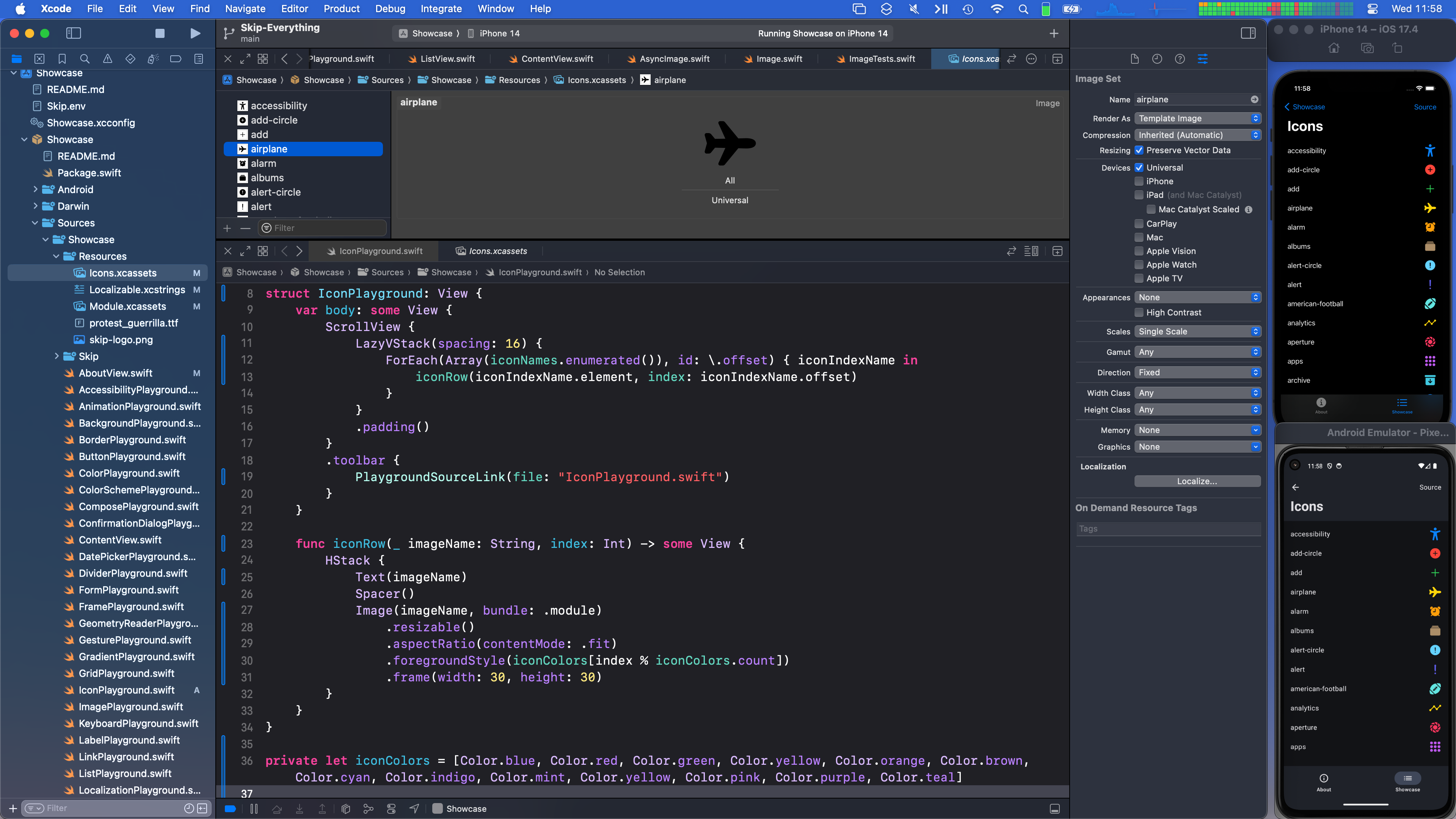
Image("baseball-icon", bundle: .module, label: Text("Baseball Icon"))
    .resizable()
    .aspectRatio(contentMode: .fit)
    .foregroundStyle(Color.cyan)
    .frame(width: 30, height: 30)
Skip currently supports Light and Dark variants of images in an asset catalog, and will display the appropriate image depending on the active color scheme. Other image asset variants like size classes are currently unsupported.
Bundled Images
In addition to using asset catalogs, images may be included in the Resources folder and referenced directly using AsyncImage to display local image resources. This works on both iOS and through Skip on Android. So if you have an image Sources/MyModule/Resources/sample.jpg then the following SwiftUI will display the image on both platforms:
AsyncImage(url: Bundle.module.url(forResource: "sample", withExtension: "jpg"))
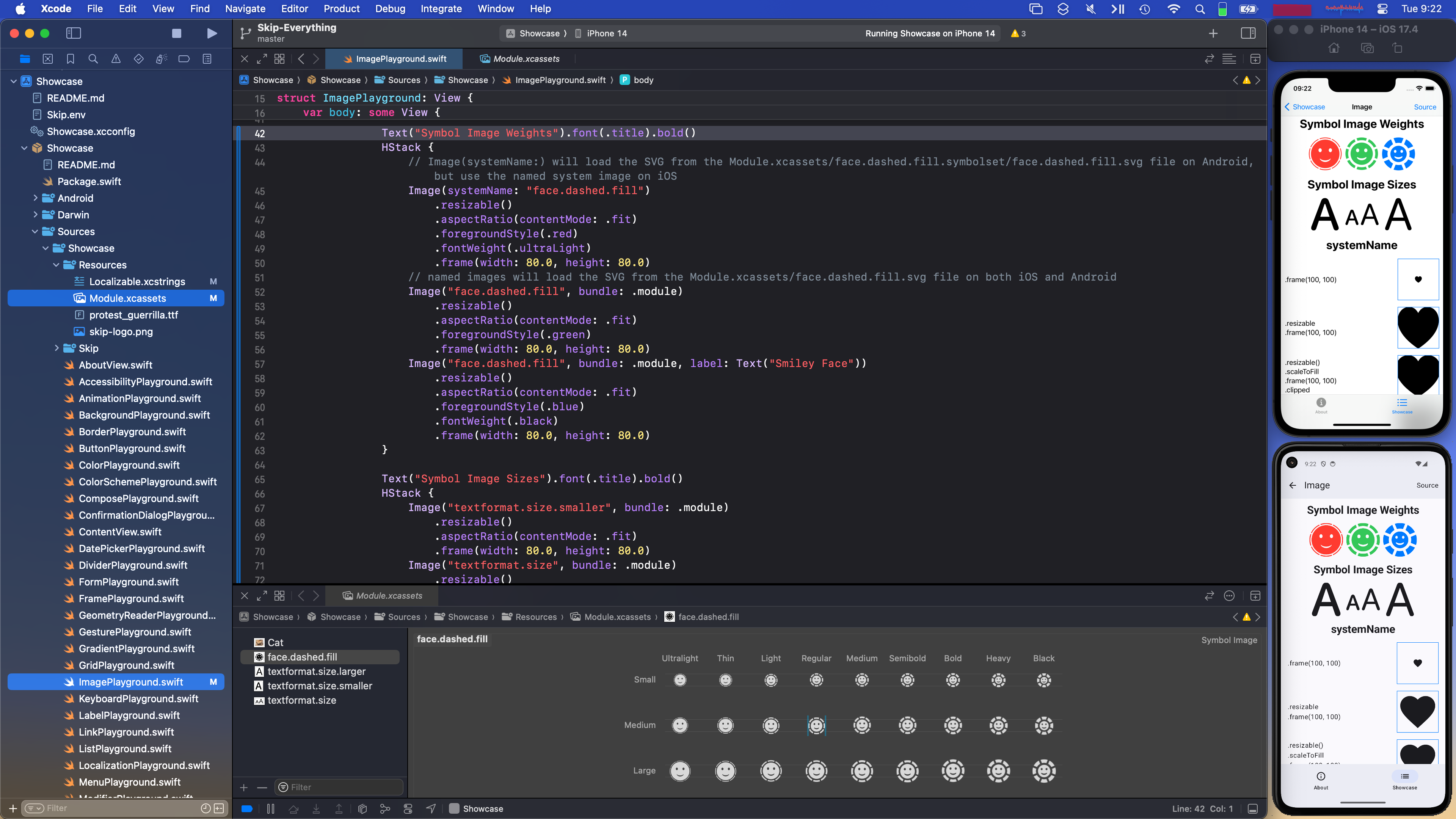
System Symbols
The Image(systemName:) constructor is used to display a standard system symbol name that is provided on Darwin platforms. There is no built-in equivalent to these symbols on Android, but you can add these symbols manually by creating a Module.xcassets asset catalog in your top-level app module’s Resources folder, and then exporting the named symbol(s) from the SF Symbols.app. These exported symbol SVG files can be dragged into your asset catalog to provide the necessary symbol data for your Android app.
See the Skip Showcase app ImagePlayground for a concrete example of using a system symbol with a exported symbol images, and see that project’s Xcode project file (screenshot) to see how the symbol is included in the .xcassets file for the app module.
SkipUI currently supports using the view’s foregroundStyle and fontWeight to customize the color and weight of the symbol, but other symbol modifiers such as symbolVariant and symbolRenderingMode are currently unsupported.
Exported symbols can be used directly, or they can be edited using an SVG editor to provide custom vector symbols for you app, as described at Creating custom symbol images for your app. You use Image(systemName:) to load a system symbol image and Image(_:bundle) to load your custom symbol, as the following code shows:
// Display a system symbol image
Image(systemName: "multiply.circle.fill")

// Display a custom symbol image that is included in the module's asset catalog
Image("custom.multiply.circle", bundle: .module)
This is discussed further in the documentation for Loading a symbol image.
Fallback Symbols
If a matching system symbol with the same name is not found in any of the asset catalog files for the top-level app module, SkipUI will fallback to a small subset of pre-defined symbol names that map to the equivalent Compose material symbols (as seen at https://developer.android.com/reference/kotlin/androidx/compose/material/icons/Icons). The fallback symbols will not match the iOS equivalents exactly, but will provide a rough approximation of the symbol’s shape and meaning.
| iOS | Android |
|---|---|
| arrow.clockwise.circle | Icons.Outlined.Refresh |
| arrow.forward | Icons.Outlined.ArrowForward |
| arrow.forward.square | Icons.Outlined.ExitToApp |
| arrow.left | Icons.Outlined.ArrowBack |
| arrowtriangle.down.fill | Icons.Outlined.ArrowDropDown |
| bell | Icons.Outlined.Notifications |
| bell.fill | Icons.Filled.Notifications |
| calendar | Icons.Outlined.DateRange |
| cart | Icons.Outlined.ShoppingCart |
| cart.fill | Icons.Filled.ShoppingCart |
| checkmark | Icons.Outlined.Check |
| checkmark.circle | Icons.Outlined.CheckCircle |
| checkmark.circle.fill | Icons.Filled.CheckCircle |
| chevron.down | Icons.Outlined.KeyboardArrowDown |
| chevron.left | Icons.Outlined.KeyboardArrowLeft |
| chevron.right | Icons.Outlined.KeyboardArrowRight |
| chevron.up | Icons.Outlined.KeyboardArrowUp |
| ellipsis | Icons.Outlined.MoreVert |
| envelope | Icons.Outlined.Email |
| envelope.fill | Icons.Filled.Email |
| exclamationmark.triangle | Icons.Outlined.Warning |
| exclamationmark.triangle.fill | Icons.Filled.Warning |
| face.smiling | Icons.Outlined.Face |
| gearshape | Icons.Outlined.Settings |
| gearshape.fill | Icons.Filled.Settings |
| hand.thumbsup | Icons.Outlined.ThumbUp |
| hand.thumbsup.fill | Icons.Filled.ThumbUp |
| heart | Icons.Outlined.FavoriteBorder |
| heart.fill | Icons.Outlined.Favorite |
| house | Icons.Outlined.Home |
| house.fill | Icons.Filled.Home |
| info.circle | Icons.Outlined.Info |
| info.circle.fill | Icons.Filled.Info |
| line.3.horizontal | Icons.Outlined.Menu |
| list.bullet | Icons.Outlined.List |
| location | Icons.Outlined.LocationOn |
| location.fill | Icons.Filled.LocationOn |
| lock | Icons.Outlined.Lock |
| lock.fill | Icons.Filled.Lock |
| magnifyingglass | Icons.Outlined.Search |
| mappin.circle | Icons.Outlined.Place |
| mappin.circle.fill | Icons.Filled.Place |
| paperplane | Icons.Outlined.Send |
| paperplane.fill | Icons.Filled.Send |
| pencil | Icons.Outlined.Create |
| person | Icons.Outlined.Person |
| person.crop.circle | Icons.Outlined.AccountCircle |
| person.crop.circle.fill | Icons.Filled.AccountCircle |
| person.crop.square | Icons.Outlined.AccountBox |
| person.crop.square.fill | Icons.Filled.AccountBox |
| person.fill | Icons.Filled.Person |
| phone | Icons.Outlined.Call |
| phone.fill | Icons.Filled.Call |
| play | Icons.Outlined.PlayArrow |
| play.fill | Icons.Filled.PlayArrow |
| plus | Icons.Outlined.Add |
| plus.circle.fill | Icons.Outlined.AddCircle |
| square.and.arrow.up | Icons.Outlined.Share |
| square.and.arrow.up.fill | Icons.Filled.Share |
| star | Icons.Outlined.Star |
| star.fill | Icons.Filled.Star |
| trash | Icons.Outlined.Delete |
| trash.fill | Icons.Filled.Delete |
| wrench | Icons.Outlined.Build |
| wrench.fill | Icons.Filled.Build |
| xmark | Icons.Outlined.Clear |
In Android-only code, you can also supply any androidx.compose.material.icons.Icons image name as the systemName. For example:
#if SKIP
Image(systemName: "Icons.Filled.Settings")
#endif
Layout
SkipUI fully supports SwiftUI’s various layout mechanisms, including HStack, VStack, ZStack, and the .frame modifier. If you discover layout edge cases where the result on Android does not match the result on iOS, please file an Issue. The following is a list of known cases where results may not match:
- When multiple elements in a
HStackuse.frame(maxWidth: .infinity)or multiple elements in aVStackuse.frame(maxHeight: .infinity), your Android layout will always divide the available space evenly between them. If any.infinityelement also specifies aminWidthorminHeightlarger than its evenly-divided slice of space, it may overlap neighboring elements rather than force them to use less space.
Lists
SwiftUI Lists are powerful and flexible components. SkipUI currently supports the following patterns for specifying List content.
Static content. Embed a child view for each row directly within the List:
List {
    Text("Row 1")
    Text("Row 2")
    Text("Row 3")
}
Indexed content. Specify an Int range and a closure to create a row for each index:
List(1...100) { index in
    Text("Row \(index)")
}
Collection content. Supply any RandomAccessCollection - typically an Array - and a closure to create a row for each element. If the elements do not implement the Identifiable protocol, specify the key path to a property that can be used to uniquely identify each element:
List([person1, person2, person3], id: \.fullName) { person in
    HStack {
        Text(person.fullName)
        Spacer()
        Text(person.age)
    }
}
ForEach content. Use ForEach to specify indexed or collection content. This allows you to mix content types.
List {
    Text("People").bold()
    ForEach([person1, person2, person3], id: \.fullName) { person in
        HStack {
            Text(person.fullName)
            Spacer()
            Text(person.age)
        }
    }
}
When using collection content or a ForEach with collection content, you can enable swipe-to-delete and drag-to-reorder by supplying a binding to the collection and the appropriate set of edit actions.
List($people, id: \.fullName, editActions: .all) { $person in
    Text(person.fullName)
        .deleteDisabled(!person.isDeletable)
    }
}
You can also enable editing by using a ForEach with the .onDelete and .onMove modifiers. Make sure your ForEach also supplies an id for each item.
List Limitations
- Compose requires that every
idvalue in aListis unique. This applies even if your list consists of multipleSectionsor uses multipleForEachcomponents to define its content. - Additionally,
idvalues must follow our Restrictions on Identifiers. SectionandForEachviews must be defined inline within their owningList. In other words, if yourListcontainsMyView,MyViewwill be rendered as a single list row even if it containsSectionorForEachcontent.- Nesting of
ForEachandSectionviews is limited. - SkipUI does not support placing modifiers on
SectionorForEachviews within lists, other thanForEach.onDeleteandForEach.onMove. - See also the
ForEachview topic.
Navigation
SwiftUI has three primary forms of navigation: TabView, NavigationStack, and modal presentations. SkipUI has implemented all three, albeit with the restrictions explained below.
SkipUI’s TabView does yet not support SwiftUI’s overflow tab behavior. Adding too many tabs will just result in too many tabs rather than SwiftUI’s automatic “More” tab. Otherwise, TabView acts as you would expect.
In SwiftUI, you push views onto a NavigationStack with NavigationLink. NavigationLink has two ways to specify its destination view: embedding the view directly, or specifying a value that is mapped to a view through the .navigationDestination modifier, as in the following code sample:
NavigationStack {
    ListView()
        .navigationTitle(Self.title)
}

struct ListView : View {
    var body: some View {
        List(City.allCases) { city in
            NavigationLink(value: city) {
                rowView(city: city)
            }
        }
        .navigationDestination(for: City.self) { city in
            CityView(city: city)
        }
    }
}
SkipUI supports both of these models. Using .navigationDestinations, however, requires some care. It is currently the case that if a pushed view defines a new .navigationDestination for key type T, it will overwrite any previous stack view’s T destination mapping. Take care not to unintentionally re-map the same key type in the same navigation stack.
Compose imposes an additional restriction as well: we must be able to stringify .navigationDestination key types. See Restrictions on Identifiers below.
Preferred Color Scheme
SkipUI fully supports the .preferredColorScheme modifier. If you created your app with the skip tool prior to v0.8.26, however, you will have to update the included Android/app/src/main/kotlin/.../Main.kt file in order for the modifier to work correctly. Using the latest Main.kt as your template, please do the following:
- Replace the all of the import statements with ones from latest
Main.kt - Replace the contents of the
setContent { ... }block with the content from the latestMain.kt - Replace the
MaterialThemeRootView()function with thePresentationRootView(context:)function from the latestMain.kt
With these updates in place, you should be able to use .preferredColorScheme successfully.
Restrictions on Identifiers
Compose requires all state values to be serializable. This restriction is typically transparent to your code, because when you use property wrappers like @State, SkipUI automatically tracks your state objects and gives Compose serializable identifiers in their place. Some SwiftUI values, however, must be stored directly in Compose, including navigationDestination values and List item identifiers. When this is the case, SkipUI creates a String from the value you supply using the following algorithm:
- If the value is
Identifiable, useString(describing: value.id) - If the value is
RawRepresentable, useString(describing: value.rawValue) - Else use
String(describing: value)
Please ensure that when using these API, the above algorithm will create unique, stable strings for unique values.
Safe Area
Like the iPhone, Android devices can render content behind system bars like the top status bar and bottom gesture area. SwiftUI code using the .ignoresSafeArea modifier to extend content behind system bars will work the same across SwiftUI and SkipUI, with one exception: SkipUI ignores the SafeAreaRegions.keyboard region. SkipUI does not represent the onscreen keyboard as a safe area. Rather, it follows the typical Android practice of shrinking the content area to fit above the keyboard.
Remember that you can use #if SKIP blocks to confine your .ignoresSafeArea calls for iOS or Android only.
Enabling or Disabling Edge-to-Edge
Modern SkipUI versions enable Jetpack Compose’s “edgeToEdge” mode by default. If you created your app with the skip tool prior to v0.8.32, however, you will have to update the included Android/app/src/main/kotlin/.../Main.kt file to render content behind system bars. Using the latest Main.kt as your template, please do the following:
- Add the following import:
import androidx.activity.enableEdgeToEdge - Add the following line to the
MainActivity.onCreate(savedInstanceState:)function:
override fun onCreate(savedInstanceState: android.os.Bundle?) {
    super.onCreate(savedInstanceState)
    enableEdgeToEdge() // <--- Add this line
    ...
With these updates in place, your app should extend below the system bars. If you’re running a modern SkipUI version and want to disable edge-to-edge mode, simply remove the enableEdgeToEdge() call.