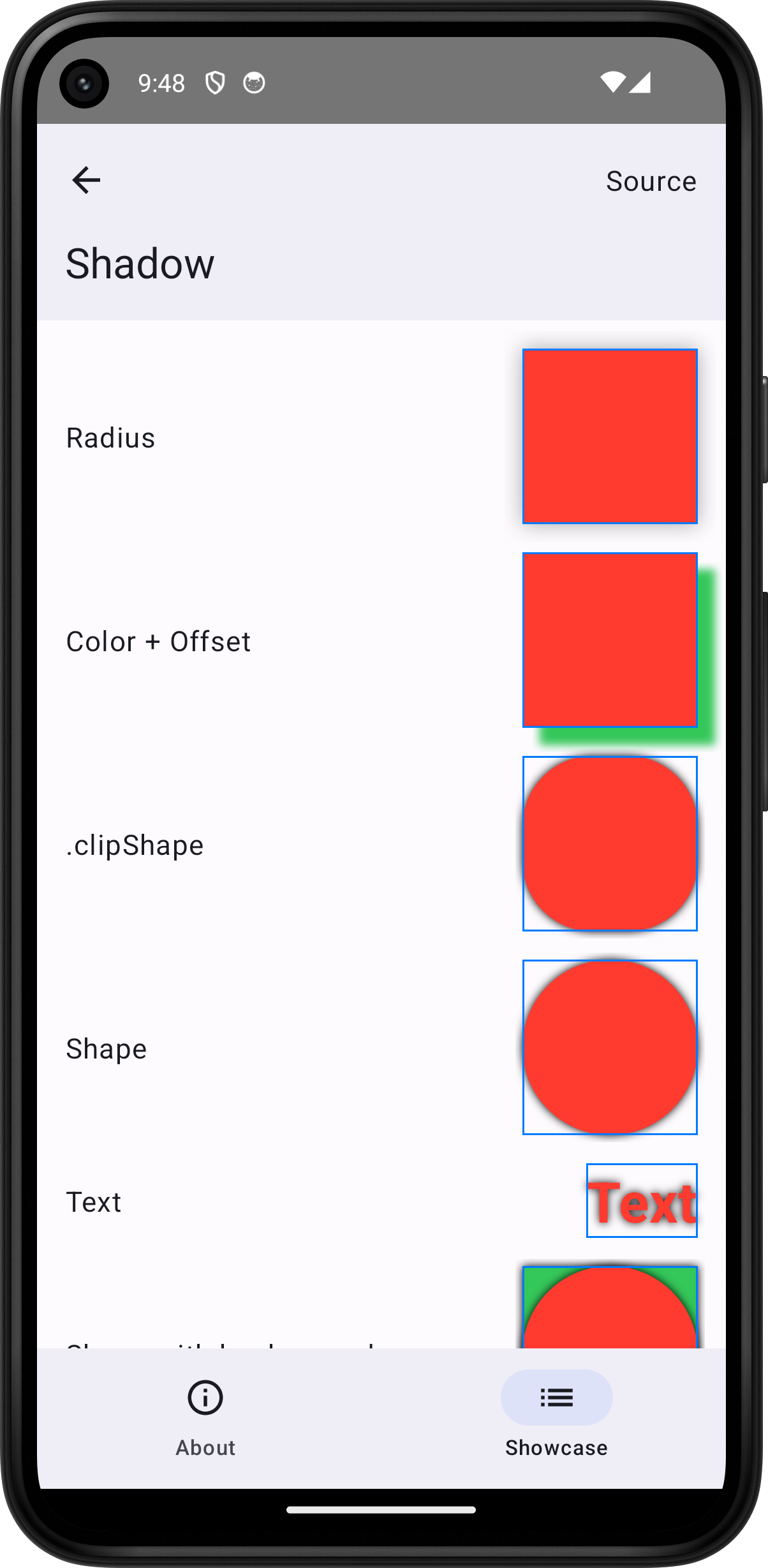
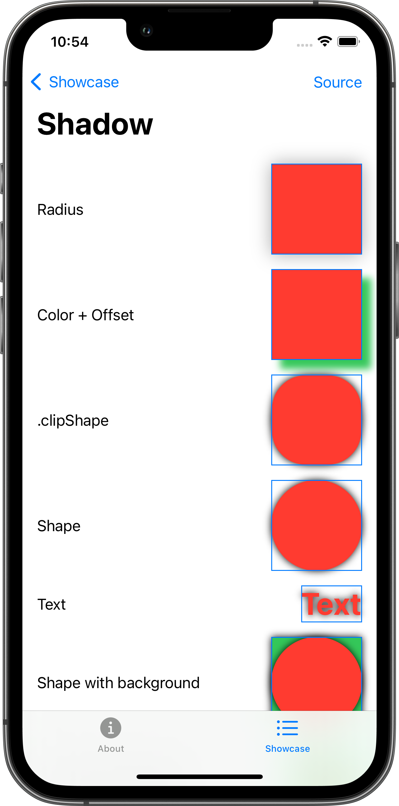
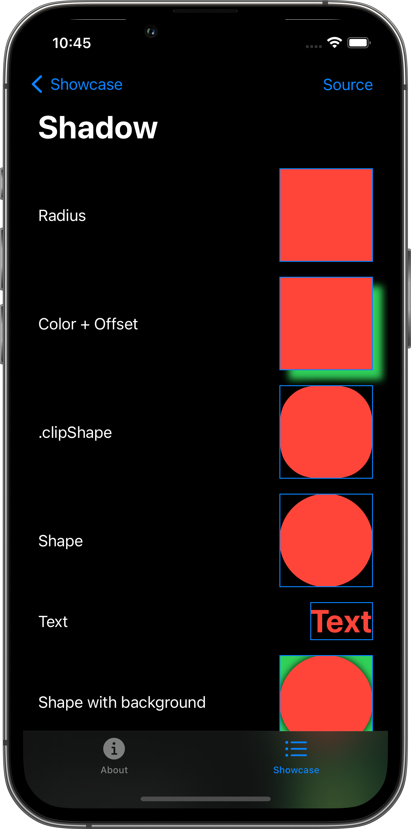
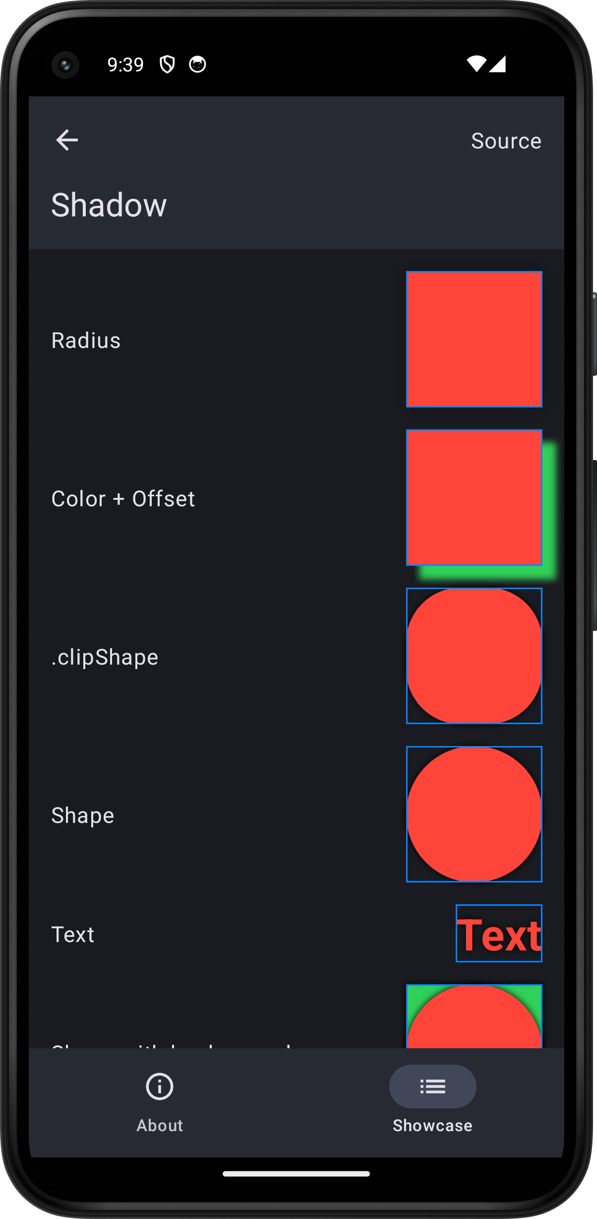
Menu

Shadow

Skip support for SwiftUI.View.shadow on Android. Consult the SkipUI module for a complete list of supported SwiftUI.

The following example screens and source code is from SkipUI’s Showcase sample app ShadowPlayground.swift

Android screenshot for Shadow component (light mode) iPhone screenshot for Shadow component (light mode) iPhone screenshot for Shadow component (dark mode) Android screenshot for Shadow component (dark mode)
import SwiftUI

struct ShadowPlayground: View {
    var body: some View {
        ScrollView {
            VStack(spacing: 16.0) {
                HStack {
                    Text("Radius")
                    Spacer()
                    Color.red
                        .frame(width: 100.0, height: 100.0)
                        .shadow(radius: 10.0)
                        .border(.blue)
                }
                HStack {
                    Text("Color + Offset")
                    Spacer()
                    Color.red
                        .frame(width: 100.0, height: 100.0)
                        .shadow(color: .green, radius: 4.0, x: 10.0, y: 10.0)
                        .border(.blue)
                }
                HStack {
                    Text(".clipShape")
                    Spacer()
                    Color.red
                        .frame(width: 100.0, height: 100.0)
                        .clipShape(RoundedRectangle(cornerRadius: 40.0))
                        .shadow(color: .black, radius: 4.0)
                        .border(.blue)
                }
                HStack {
                    Text("Shape")
                    Spacer()
                    Circle()
                        .fill(.red)
                        .frame(width: 100.0, height: 100.0)
                        .shadow(color: .black, radius: 4.0)
                        .border(.blue)
                }
                HStack {
                    Text("Text")
                    Spacer()
                    Text("Text").font(.largeTitle).bold()
                        .foregroundStyle(.red)
                        .shadow(color: .black, radius: 4.0)
                        .border(.blue)
                }
                HStack {
                    Text("Shape with background")
                    Spacer()
                    Circle()
                        .fill(.red)
                        .frame(width: 100.0, height: 100.0)
                        .shadow(color: .black, radius: 4.0)
                        .background {
                            Color.green.shadow(color: .black, radius: 4.0)
                        }
                        .border(.blue)
                }
                HStack {
                    Text("Text with background")
                    Spacer()
                    Text("Text").font(.largeTitle).bold()
                        .foregroundStyle(.red)
                        .padding(8.0)
                        .shadow(color: .black, radius: 4.0)
                        .background {
                            Color.green.shadow(color: .black, radius: 4.0)
                        }
                        .border(.blue)
                }
                HStack {
                    Text("Shape with overlay")
                    Spacer()
                    Circle()
                        .fill(.red)
                        .frame(width: 100.0, height: 100.0)
                        .shadow(color: .black, radius: 4.0)
                        .overlay {
                            Text("Overlay").font(.largeTitle)
                                .foregroundStyle(.green)
                                .shadow(color: .black, radius: 4.0)
                        }
                        .border(.blue)
                }
                HStack {
                    Text("Container")
                    Spacer()
                    VStack {
                        Text("Top")
                        Text("Bottom")
                    }
                    .padding(8.0)
                    .shadow(color: .black, radius: 4.0)
                    .border(.blue)
                }
                HStack {
                    Text("Button")
                    Spacer()
                    Button("Tap") {
                        logger.log("Tap")
                    }
                    .buttonStyle(.bordered)
                    .shadow(color: .black, radius: 4.0)
                    .border(.blue)
                }
                Toggle("Toggle", isOn: .constant(true))
                    .shadow(color: .black, radius: 4.0)
                    .border(.blue)
                HStack {
                    Text("Label")
                    Spacer()
                    Label("Title", systemImage: "heart.fill")
                        .foregroundStyle(.red)
                        .shadow(color: .black, radius: 4.0)
                        .border(.blue)
                }
                HStack {
                    Text("Image")
                    Spacer()
                    Image(systemName: "heart.fill")
                        .foregroundStyle(.red)
                        .shadow(color: .black, radius: 4.0)
                        .border(.blue)
                }
            }
            .padding()
        }
        .toolbar {
            PlaygroundSourceLink(file: "ShadowPlayground.swift")
        }
    }
}