Stack
Skip support for SwiftUI Stacks on Android. Consult the SkipUI module for a complete list of supported SwiftUI.
The following example screens and source code is from SkipUI’s
Showcase sample app
StackPlayground.swift
import SwiftUI
struct StackPlayground: View {
var body: some View {
ScrollView {
VStack(spacing: 16.0) {
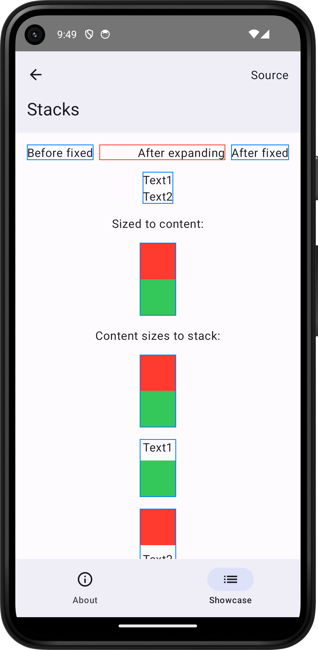
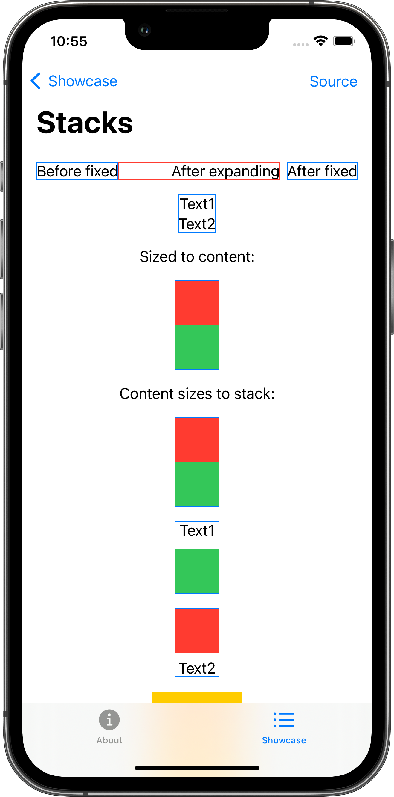
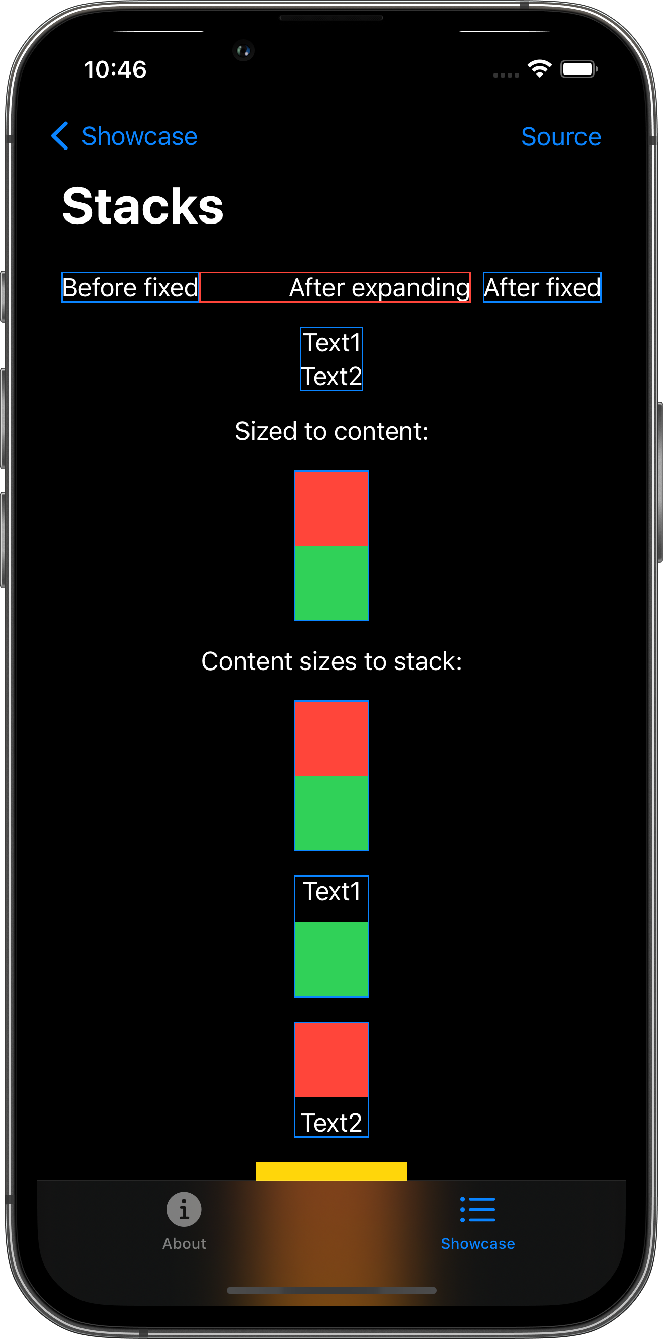
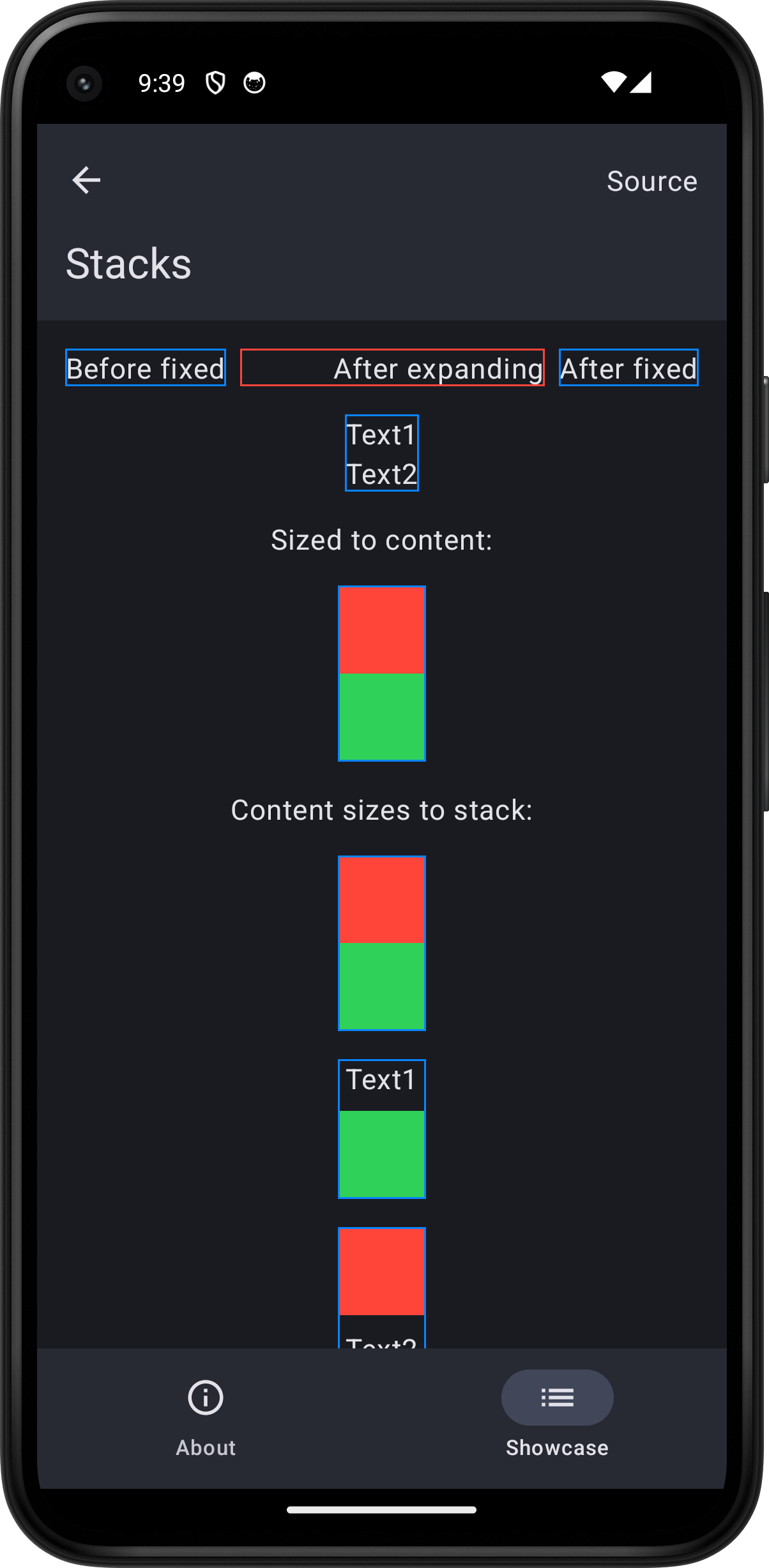
HStack {
Text("Before fixed")
.border(Color.blue)
HStack {
Spacer()
Text("After expanding")
}
.border(Color.red)
Text("After fixed")
.border(Color.blue)
}
VStack {
Text("Text1")
Text("Text2")
}
.border(Color.blue)
Text("Sized to content:")
VStack(spacing: 0.0) {
Color.red.frame(width: 50.0, height: 50.0)
Color.green.frame(width: 50.0, height: 50.0)
}
.border(Color.blue)
Text("Content sizes to stack:")
VStack(spacing: 0.0) {
Color.red
Color.green
}
.frame(width: 50.0, height: 100.0)
.border(Color.blue)
VStack {
Text("Text1")
Color.green.frame(width: 50.0, height: 50.0)
}
.border(Color.blue)
VStack {
Color.red.frame(width: 50.0, height: 50.0)
Text("Text2")
}
.border(Color.blue)
VStack(content: horizontalStripes)
.background(.yellow)
.frame(width: 100.0, height: 100.0)
HStack(content: verticalStripes)
.background(.yellow)
.frame(width: 100.0, height: 100.0)
ZStack {
Color.yellow
Color.red.padding(25.0)
}
.frame(width: 100.0, height: 100.0)
}
.padding()
}
.toolbar {
PlaygroundSourceLink(file: "StackPlayground.swift")
}
}
// Note: these functions are also a test that we can pass functions to SwiftUI content view builders.
@ViewBuilder private func horizontalStripes() -> some View {
Spacer()
Color.red.frame(height: 20.0)
Spacer()
Color.red.frame(height: 20.0)
Spacer()
}
@ViewBuilder private func verticalStripes() -> some View {
Spacer()
Color.red.frame(width: 20.0)
Spacer()
Color.red.frame(width: 20.0)
Spacer()
}
}