Modifier
Skip support for custom View Modifiers on Android. Consult the SkipUI module for a complete list of supported SwiftUI.
The following example screens and source code is from SkipUI’s
Showcase sample app
ModifierPlayground.swift
import SwiftUI
struct ModifierPlayground: View {
var body: some View {
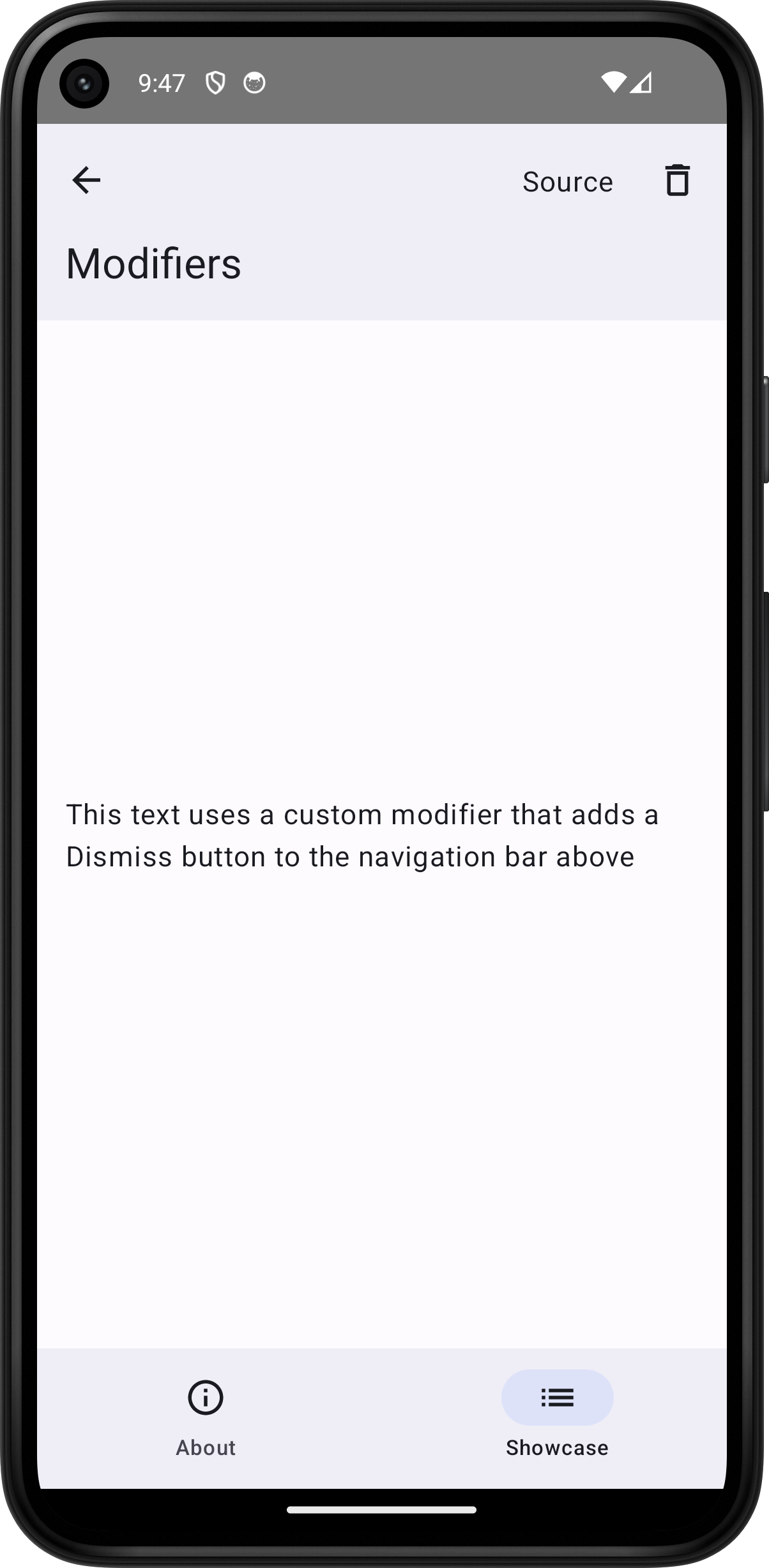
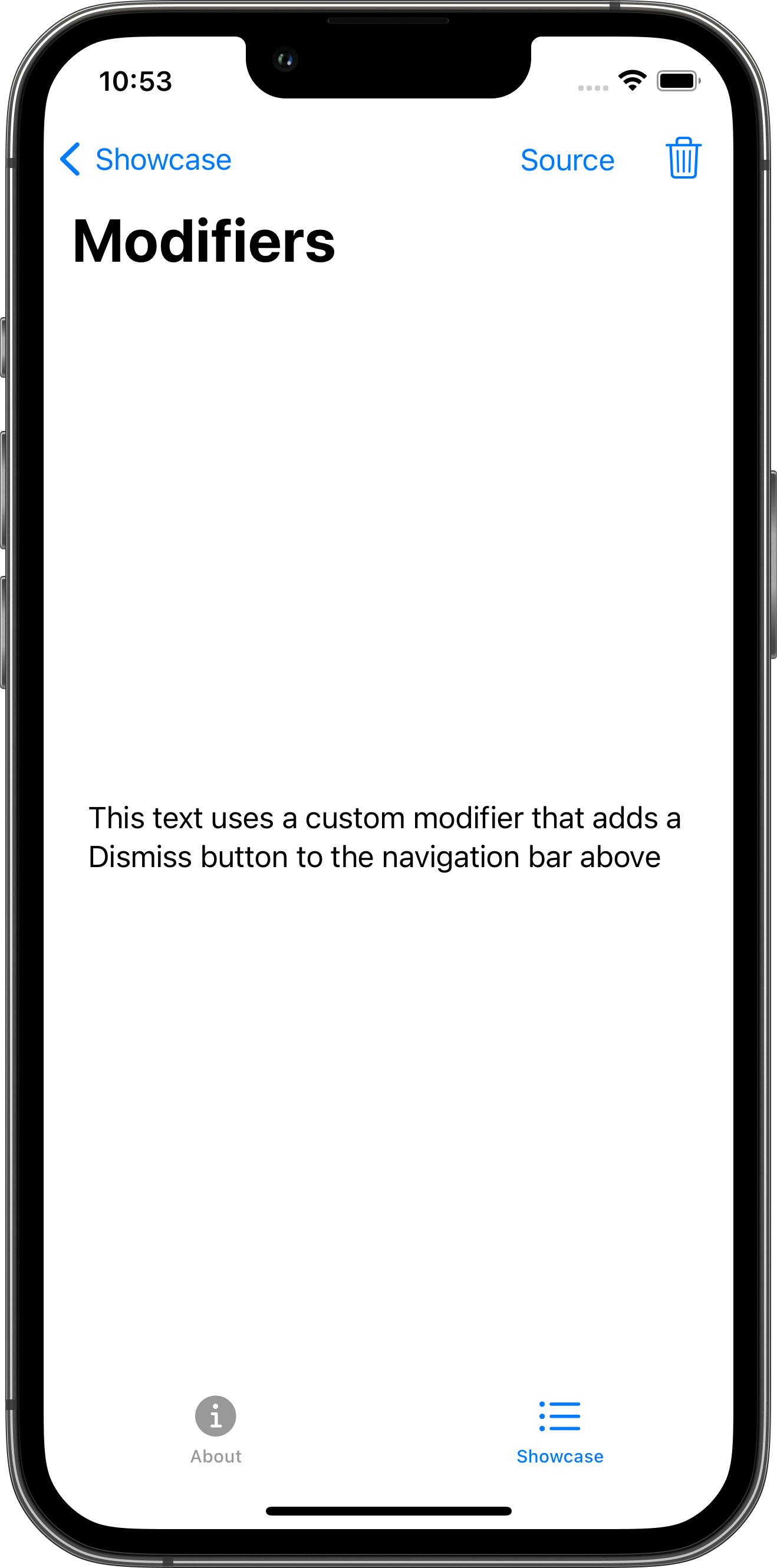
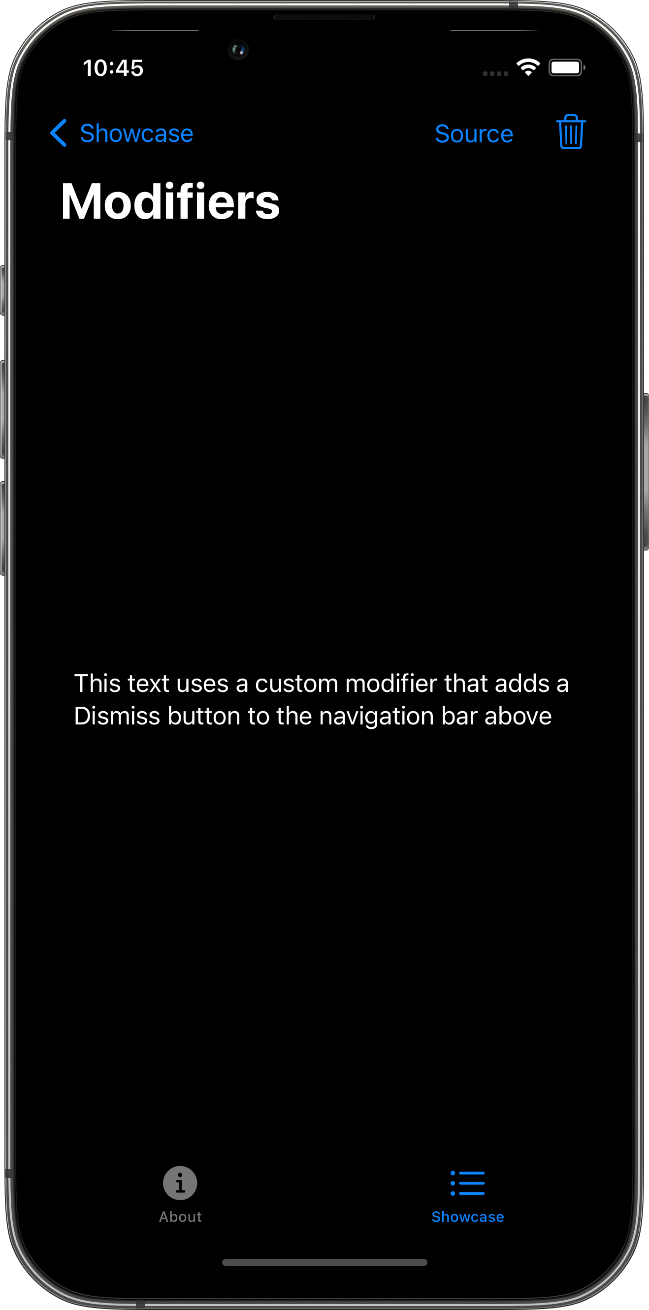
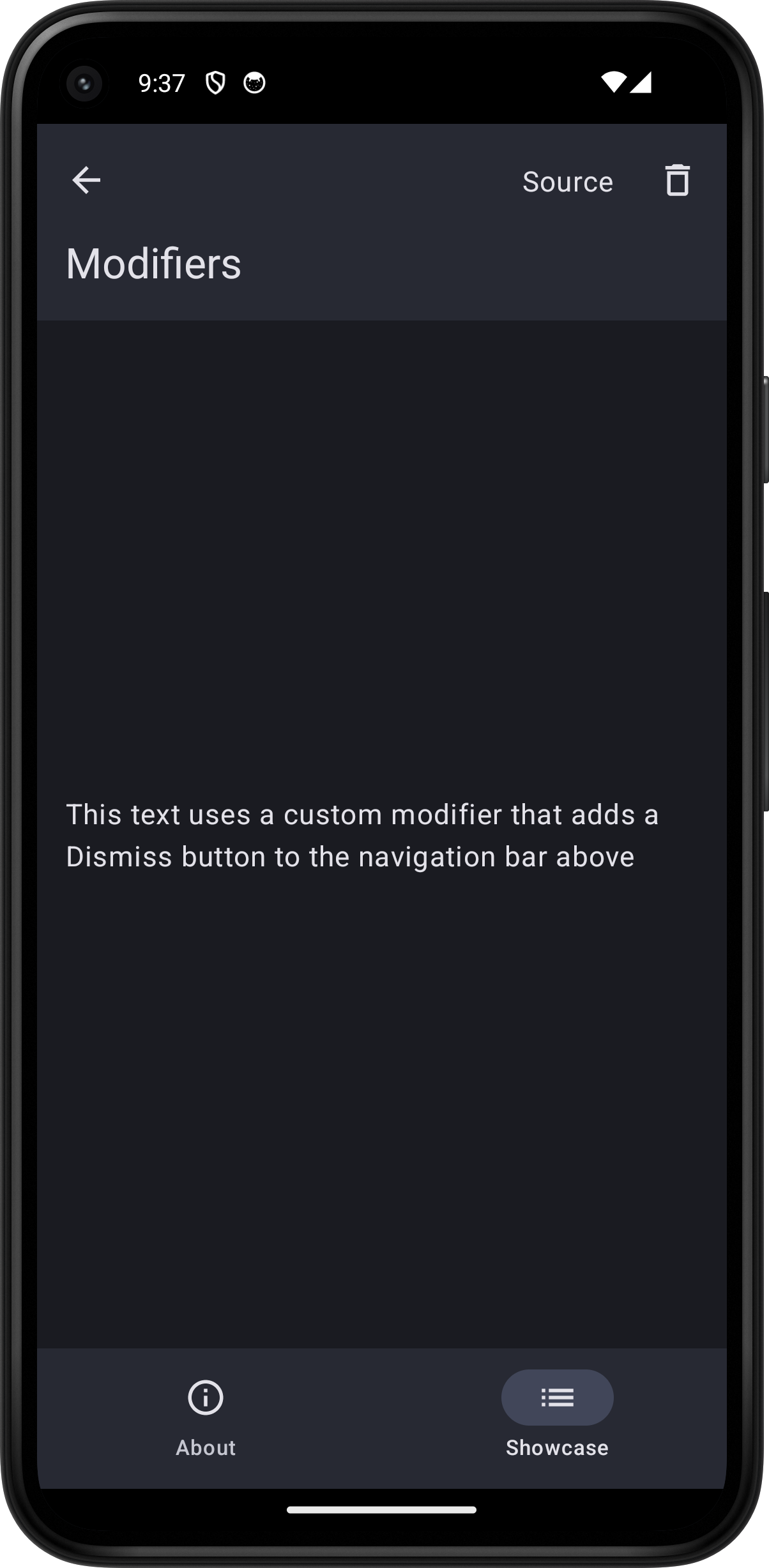
Text("This text uses a custom modifier that adds a Dismiss button to the navigation bar above")
.padding()
.dismissable()
.toolbar {
PlaygroundSourceLink(file: "ModifierPlayground.swift")
}
}
}
extension View {
public func dismissable() -> some View {
modifier(DismissModifier())
}
}
struct DismissModifier: ViewModifier {
@State var isConfirmationPresented = false
@Environment(\.dismiss) var dismiss
func body(content: Content) -> some View {
content
.toolbar {
Button(action: { isConfirmationPresented = true }) {
Label("Dismiss", systemImage: "trash")
}
}
.confirmationDialog("Dismiss", isPresented: $isConfirmationPresented) {
Button("Dismiss", role: .destructive, action: { dismiss() })
}
}
}