Toggle
Skip support for SwiftUI.Toggle on Android. Consult the SkipUI module for a complete list of supported SwiftUI.
The following example screens and source code is from SkipUI’s
Showcase sample app
TogglePlayground.swift
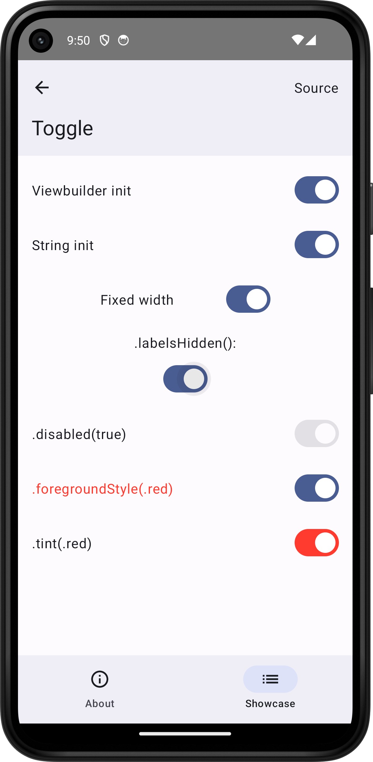
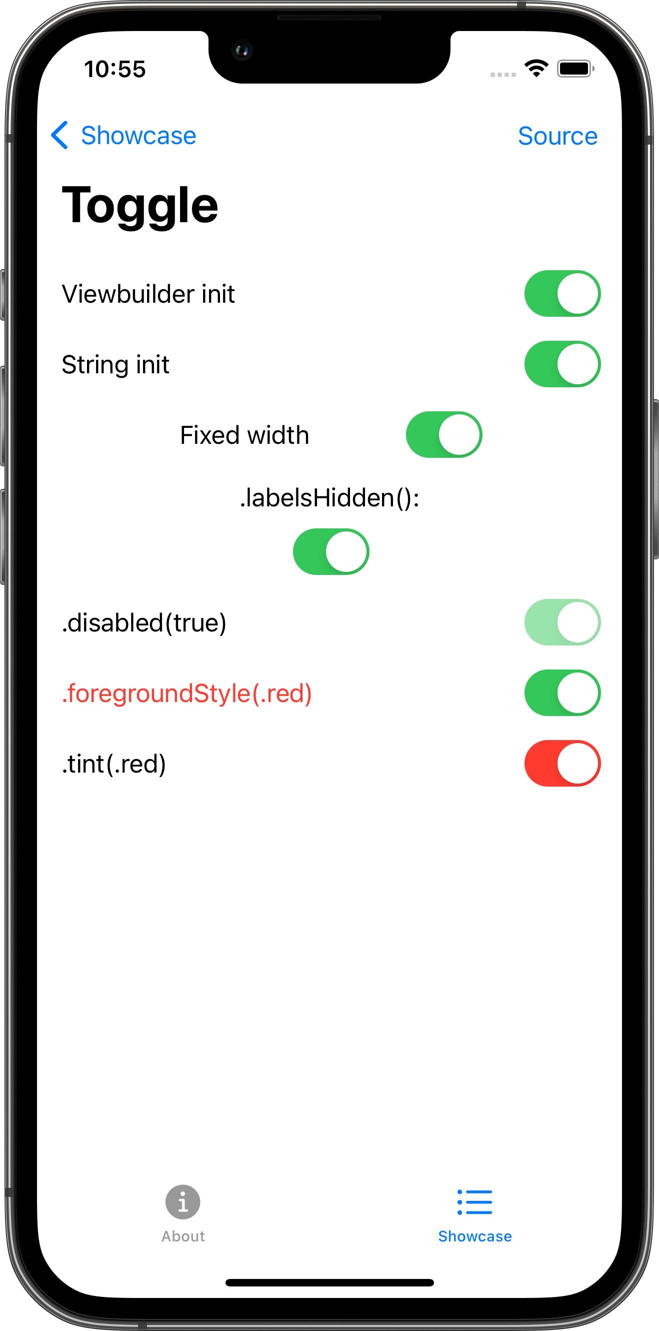
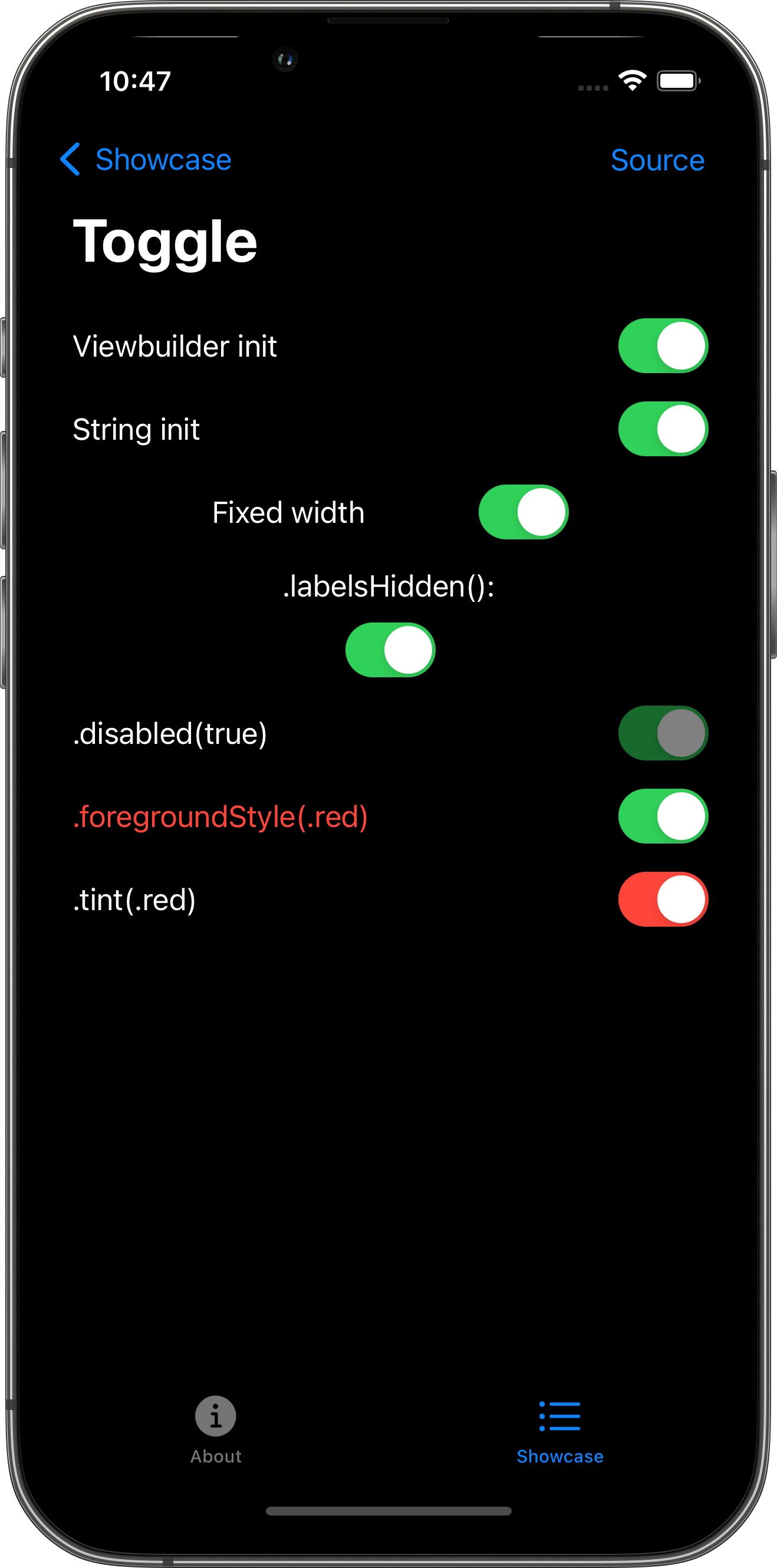
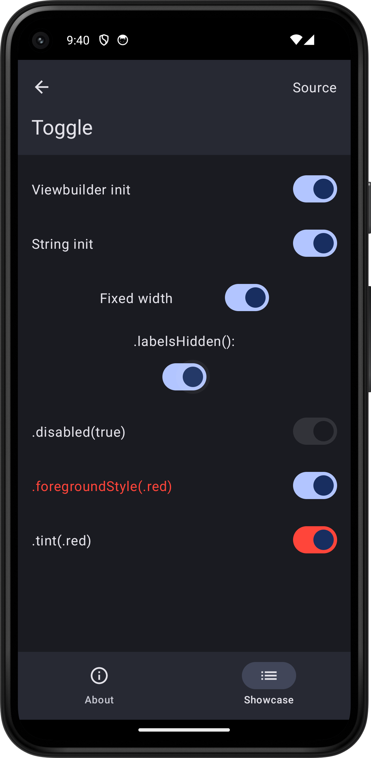
import SwiftUI

struct TogglePlayground: View {
    @State var isOn = false

    var body: some View {
        ScrollView {
            VStack(spacing: 16.0) {
                Toggle(isOn: $isOn) {
                    Text("Viewbuilder init")
                }
                Toggle("String init", isOn: $isOn)
                Toggle("Fixed width", isOn: $isOn)
                    .frame(width: 200.0)
                VStack {
                    Text(".labelsHidden():")
                    Toggle("Label", isOn: $isOn)
                }
                .labelsHidden()
                Toggle(".disabled(true)", isOn: $isOn)
                    .disabled(true)
                Toggle(".foregroundStyle(.red)", isOn: $isOn)
                    .foregroundStyle(.red)
                Toggle(".tint(.red)", isOn: $isOn)
                    .tint(.red)
            }
            .padding()
        }
        .toolbar {
            PlaygroundSourceLink(file: "TogglePlayground.swift")
        }
    }
}