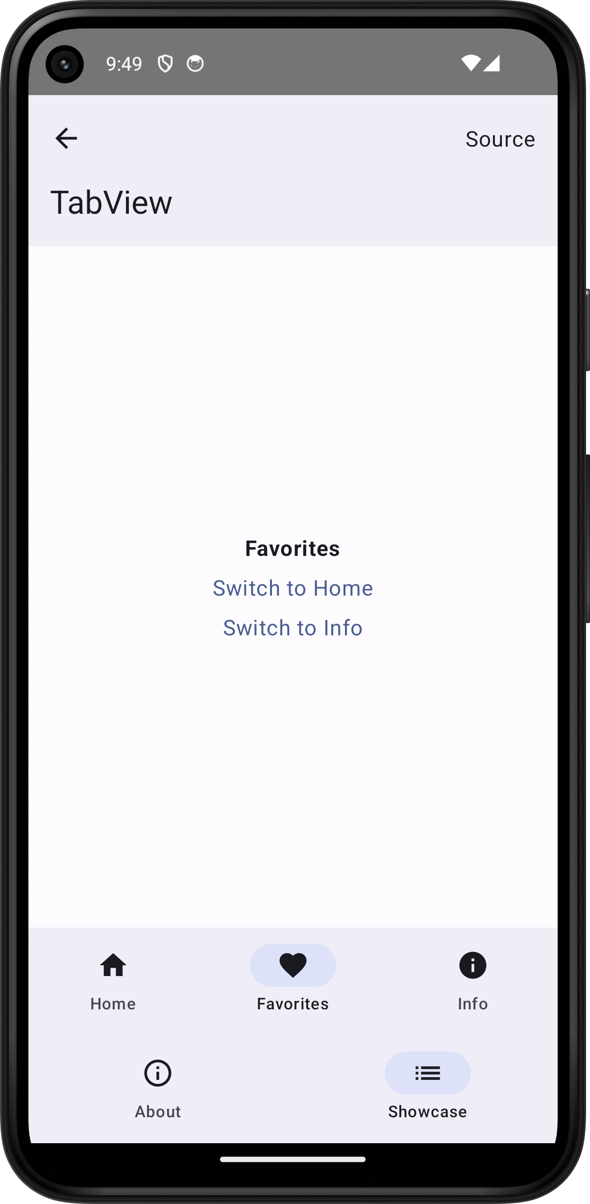
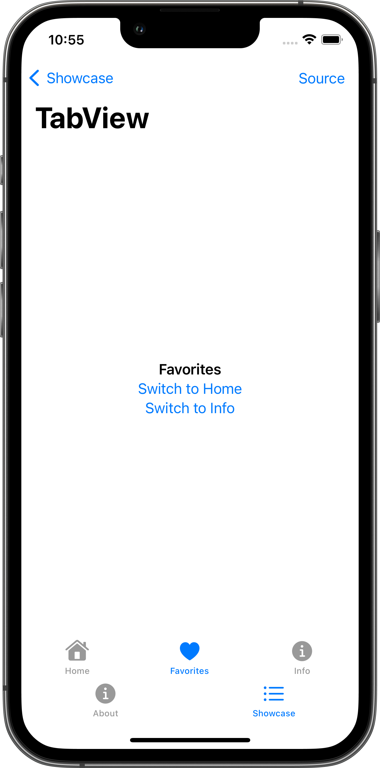
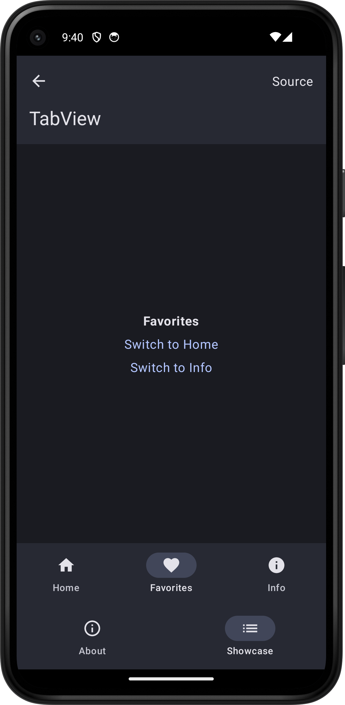
TabView
Skip support for SwiftUI.TabView on Android. Consult the SkipUI module for a complete list of supported SwiftUI.
The following example screens and source code is from SkipUI’s
Showcase sample app
TabViewPlayground.swift

import SwiftUI

struct TabViewPlayground: View {
    @State var selectedTab = "Home"

    var body: some View {
        TabView(selection: $selectedTab) {
            TabPlaygroundContentView(label: "Home", selectedTab: $selectedTab)
                .tabItem { Label("Home", systemImage: "house.fill") }
                .tag("Home")
            TabPlaygroundContentView(label: "Favorites", selectedTab: $selectedTab)
                .tabItem { Label("Favorites", systemImage: "heart.fill") }
                .tag("Favorites")
            TabPlaygroundContentView(label: "Info", selectedTab: $selectedTab)
                .tabItem { Label("Info", systemImage: "info.circle.fill") }
                .tag("Info")
        }
        .toolbar {
            PlaygroundSourceLink(file: "TabViewPlayground.swift")
        }
    }
}

struct TabPlaygroundContentView: View {
    let label: String
    @Binding var selectedTab: String

    var body: some View {
        VStack {
            Text(label).bold()
            if label != "Home" {
                Button("Switch to Home") {
                    selectedTab = "Home"
                }
            }
            if label != "Favorites" {
                Button("Switch to Favorites") {
                    selectedTab = "Favorites"
                }
            }
            if label != "Info" {
                Button("Switch to Info") {
                    selectedTab = "Info"
                }
            }
        }
    }
}