ProgressView
Skip support for SwiftUI.ProgressView on Android. Consult the SkipUI module for a complete list of supported SwiftUI.
The following example screens and source code is from SkipUI’s
Showcase sample app
ProgressViewPlayground.swift
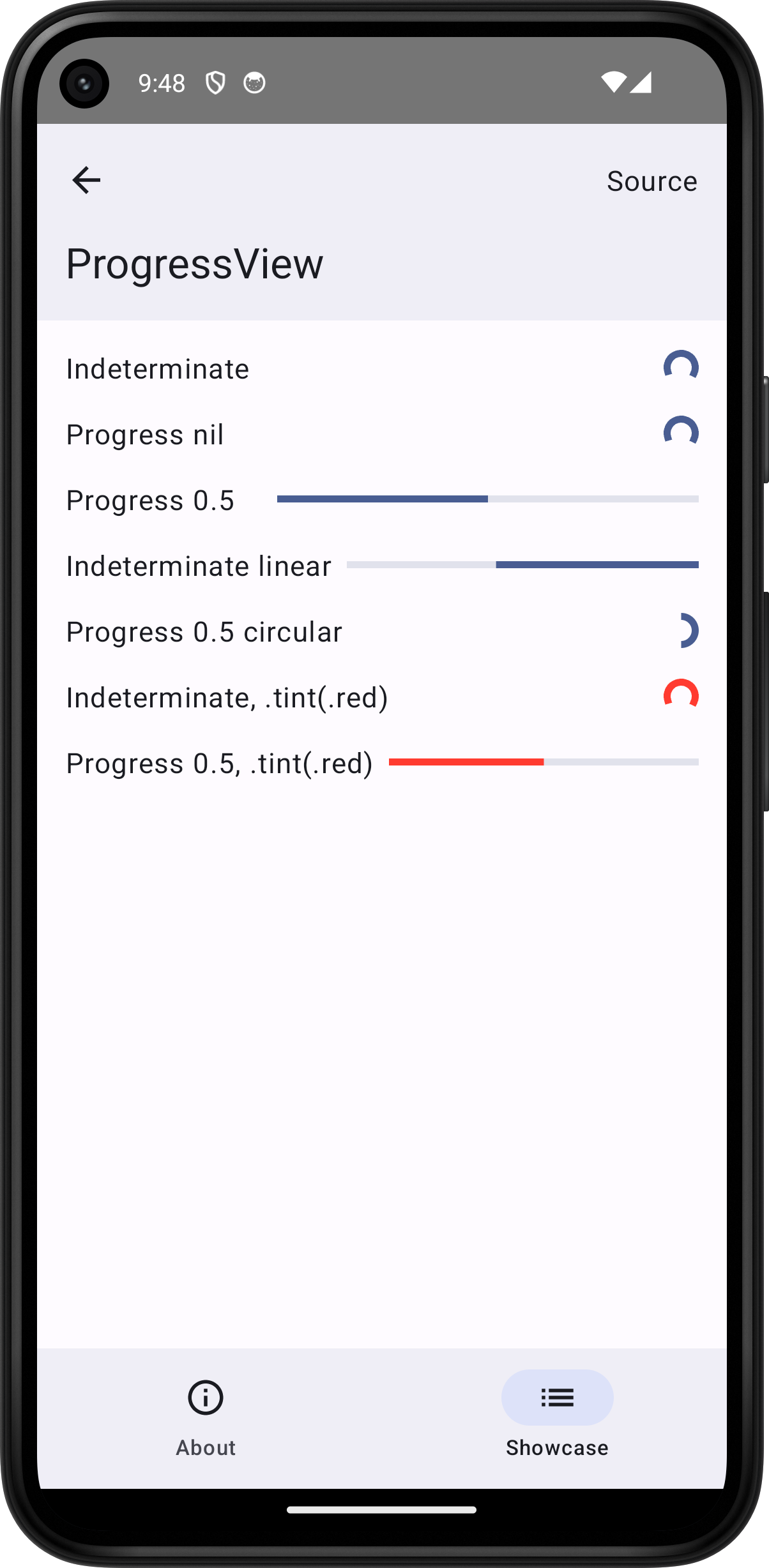
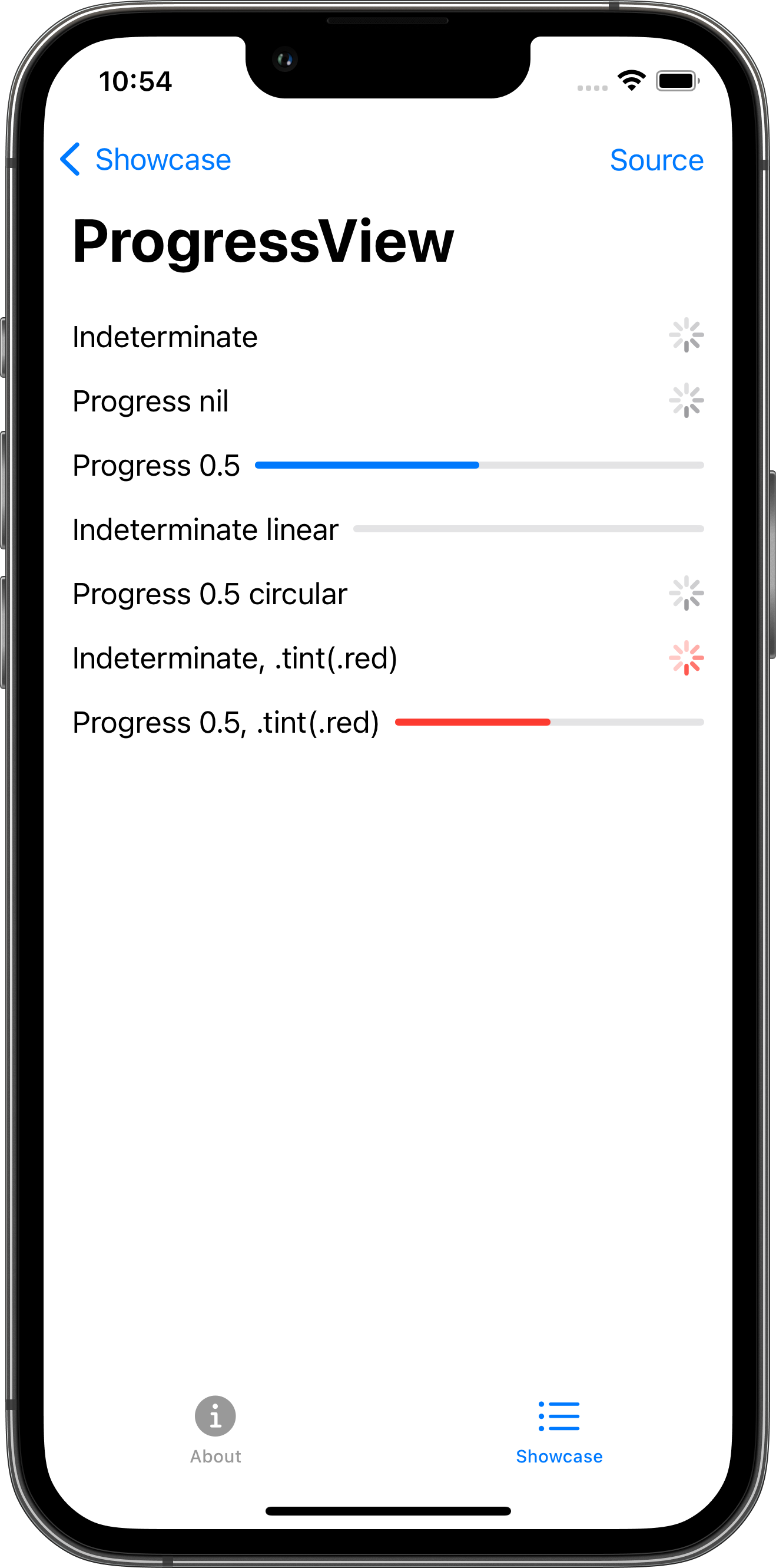
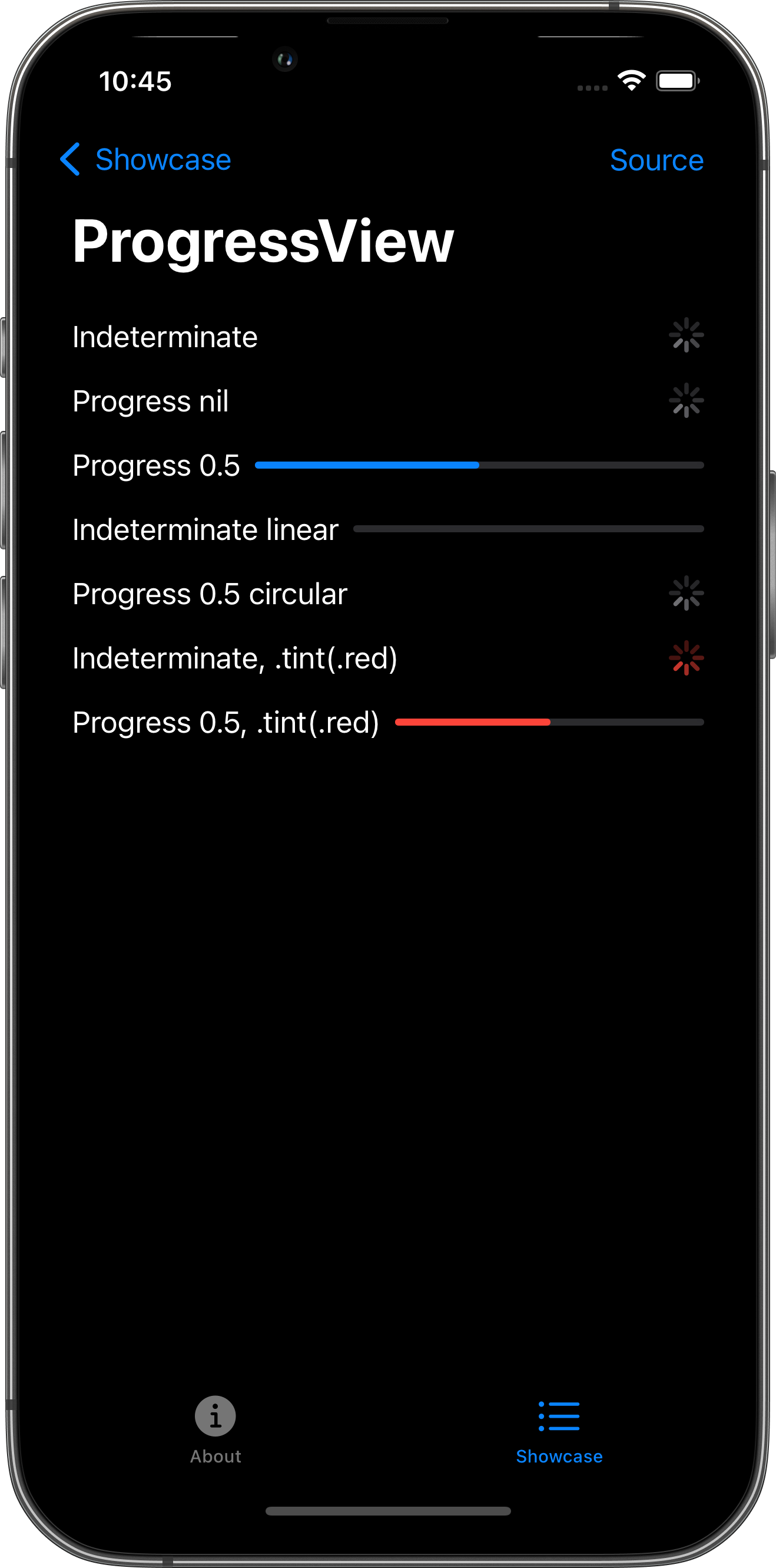
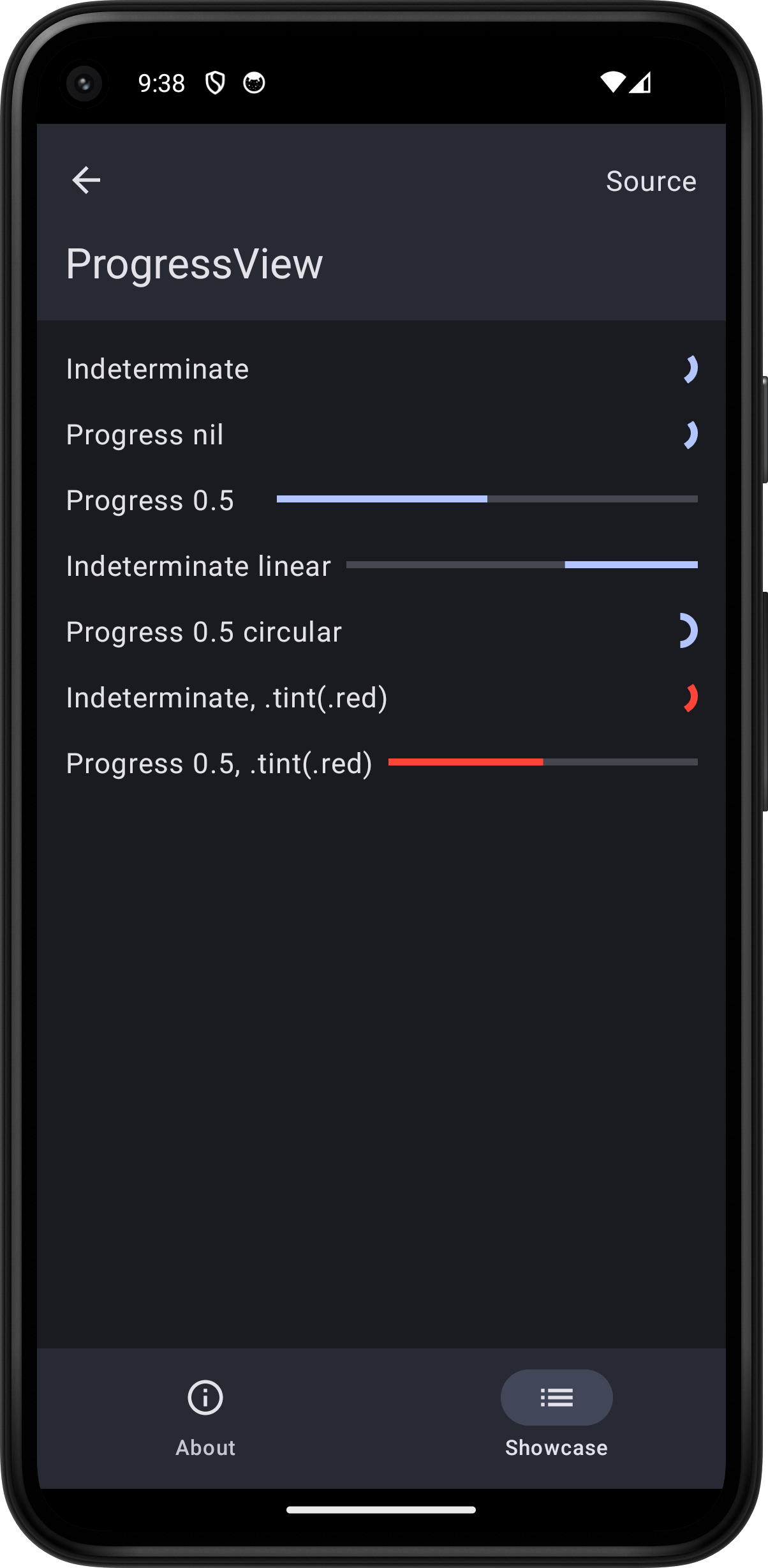
import SwiftUI

struct ProgressViewPlayground: View {
    var body: some View {
        ScrollView {
            VStack(spacing: 16.0) {
                HStack {
                    Text("Indeterminate")
                    Spacer()
                    ProgressView()
                }
                HStack {
                    Text("Progress nil")
                    Spacer()
                    ProgressView(value: nil, total: 1.0)
                }
                HStack {
                    Text("Progress 0.5")
                    Spacer()
                    ProgressView(value: 0.5)
                }
                HStack {
                    Text("Indeterminate linear")
                    Spacer()
                    ProgressView()
                        .progressViewStyle(.linear)
                }
                HStack {
                    Text("Progress 0.5 circular")
                    Spacer()
                    ProgressView(value: 0.5)
                        .progressViewStyle(.circular)
                }
                HStack {
                    Text("Indeterminate, .tint(.red)")
                    Spacer()
                    ProgressView()
                        .tint(.red)
                }
                HStack {
                    Text("Progress 0.5, .tint(.red)")
                    Spacer()
                    ProgressView(value: 0.5)
                        .tint(.red)
                }
            }
            .padding()
        }
        .toolbar {
            PlaygroundSourceLink(file: "ProgressViewPlayground.swift")
        }
    }
}