Skip Showcase Walkthrough (18:00)
Explore the Skip Showcase app demonstrating and exercising Skip’s support for various SwiftUI components on Android. Learn what your SwiftUI interfaces will look like when represented by Jetpack Compose views on Android devices.
You can also view this video on YouTube.Transcript
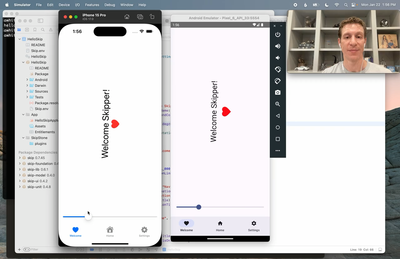
Welcome to our video exploring the Skip showcase app.
Skip is a new technology for creating dual platform iOS and Android apps in Xcode using Swift and SwiftUI.
To find out more about Skip, visit our website at skip.tools.
The showcase app is a SwiftUI app in that the tab bar renders differently.
The reason for these small differences is that Skip creates entirely native UIs on each platform.
On iOS, your SwiftUI is running unaltered.
On Android, Skip vends the SwiftUI API on top of Jetpack Compose, so your Android app has a native Jetpack Compose UI.
With Skip, your apps don’t just try to look native or try to mimic native behavior, they truly are native.
We believe that this is by far the best experience for users.
It means that your app gives them exactly what they expect and fits in with the rest of the system.
Now let’s check out the showcase.
As you can see, it’s nothing fancy.
It’s just a list of SwiftUI features and constructs that Skip supports and that we want to exercise.
And again, this screen shows some of the small differences that you can expect when running SwiftUI on Android.
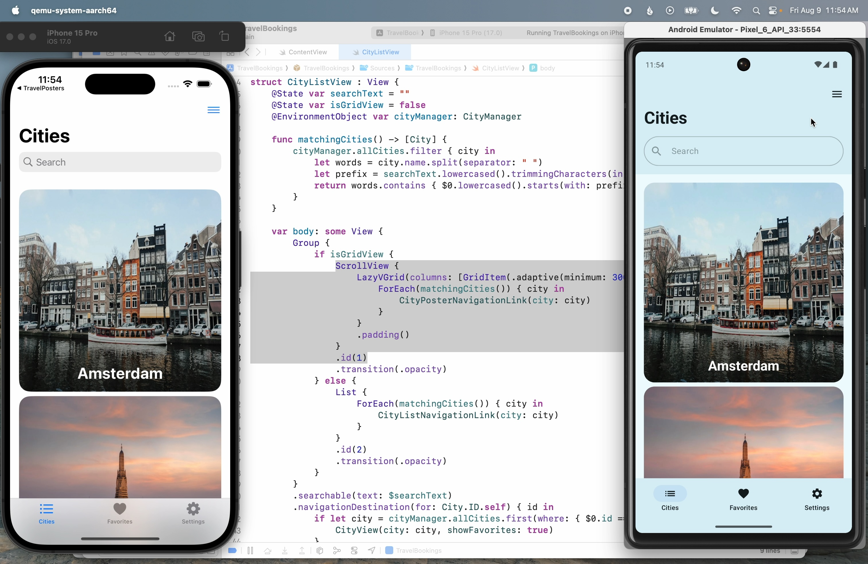
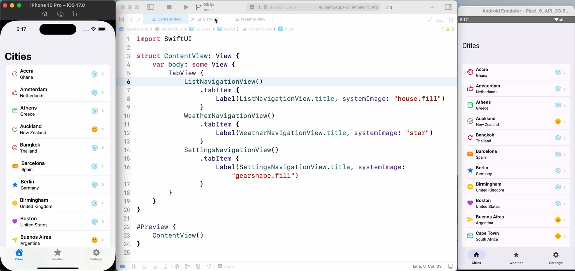
The screen consists of a navigation stack with the searchable modifier applied so you get a search bar, and then a list of components.
You can see the top bar on iOS expands and collapses, and we’ve used the material component called the medium top app bar to implement the same behavior in Compose.
The search field too behaves the same way.
The list is an interesting one because native Android lists don’t have any intrinsic styling.
They’re more akin to SwiftUI lazy VStacks.
We’ve gone ahead and applied a default styling that fits in with Android, but also fits in with the iOS version.
We may tweak this styling over time.
In fact, by the time you watch this video, some things might be subtly different.
And almost certainly, this list of supported components will have expanded.
I actually made this video a few weeks ago, but we had added so many things in the meantime that I’ve decided to remake it tonight.
If you ever want to find out the current state of SwiftUI support in Skip, you can visit our SkipUI modules readme.
This is an open source package on GitHub, and the readme is very informative.
It tells you about the module, its status, how to contribute yourself if you so choose, some of our implementation details, how you can mix Compose code into your SwiftUI to customize for Android if you like.
But the table that we are most interested in right now is this list of supported SwiftUI features.
You can always consult this for an up-to-date list of our SwiftUI support.
And it goes on to detail some of the limitations and workarounds you can apply.
So let’s get back to Xcode and our showcase.
Let’s go ahead and dive into a playground.
We’ll just choose the first one because this is typical of a lot of the showcase playgrounds.
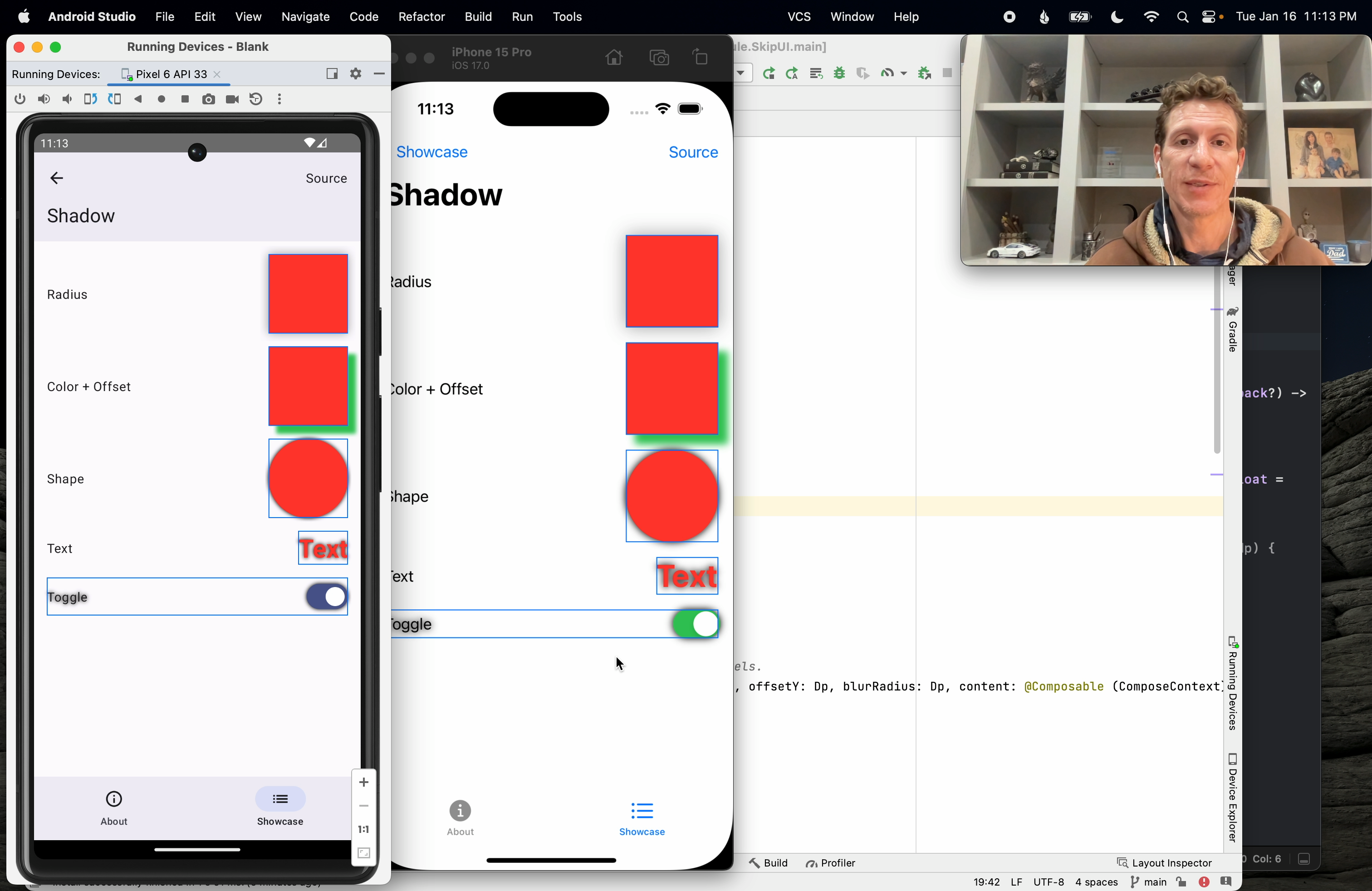
There is some pseudocode on the left describing what we’re exercising and the result on the right.
So for example, the SwiftUI modifier .background, if you supply .red, you just get red.
If you supply .red.gradient, SwiftUI actually builds a subtle red gradient for you, and we’ve aped that behavior on Android.
And so on down the list to more complex examples.
If you’re ever unsure of what exactly the pseudocode means, you can dive straight into the source for any of these playgrounds using the source button we’ve added to the toolbars.
This takes you to the GitHub page for the source code for that screen.
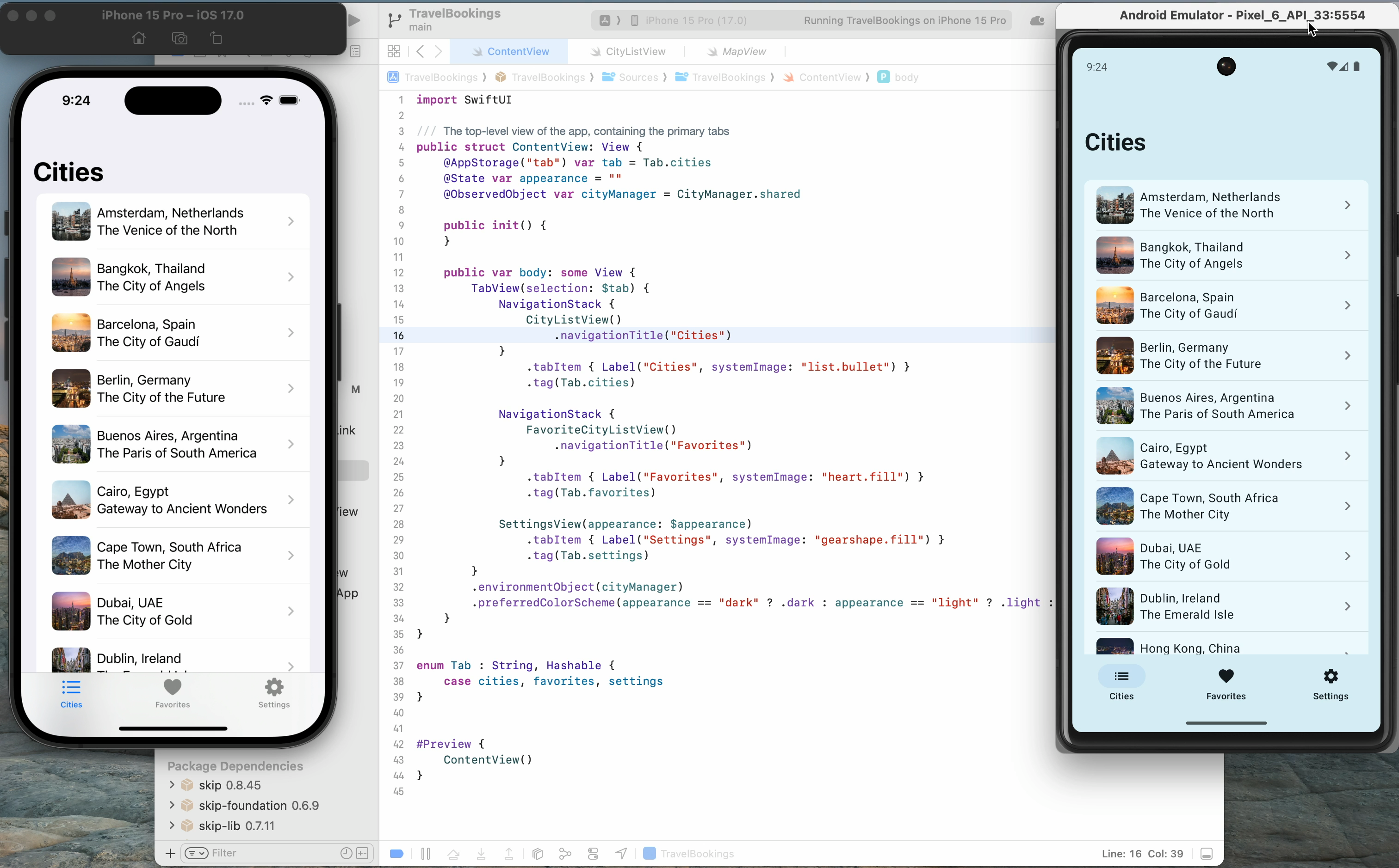
Now since we have Xcode open, we can do one better and just view it in Xcode.
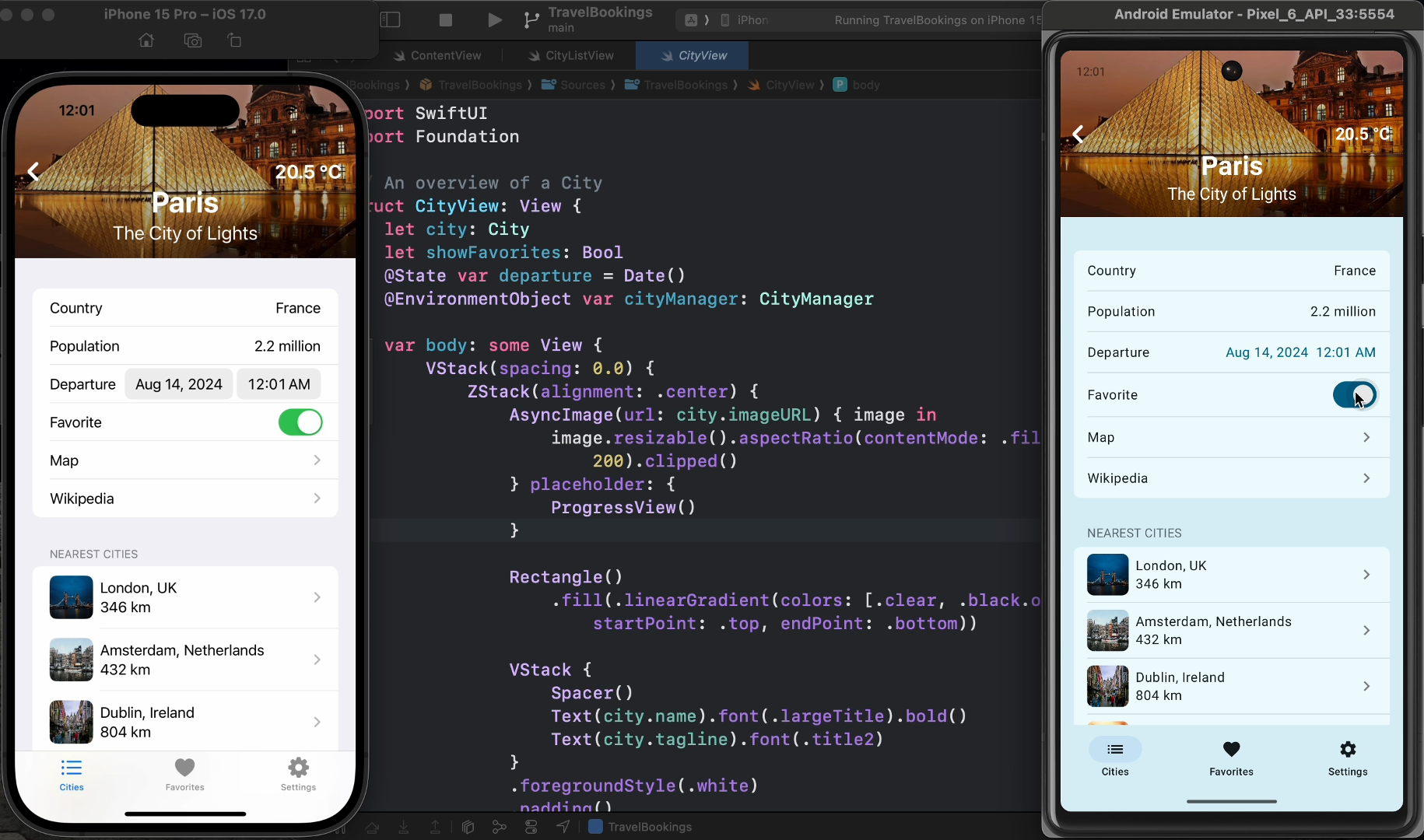
Here, by the way, is the content view setting up the showcase apps tabs.
We are interested in the background playground.
And we can see its source code here.
There’s nothing clever about this source.
It is a scroll view with a VStack in it and then a series of HStacks, each of which has some pseudocode text, a spacer, and then whatever we’re trying to exercise, background.red, background.red.gradient, and so on down the list.
The goal of our playgrounds is not to be clever.
It’s not to introduce abstractions that might obscure the purpose of each playground entry.
Repetitive code is fine.
We’re just trying to exercise the feature.
Another takeaway that we want you to see from this code is that it is standard SwiftUI.
Skip isn’t trying to introduce a new development language or a new UI framework.
We’re happy to outsource those tasks to Apple.
We think they’ve done a great job with Swift and SwiftUI.
Our goal is to let you leverage your iOS skills to create truly native apps for both iOS and Android.
Now, this doesn’t mean you can’t customize your code for Android.
We actually have many ways of adding Android or iOS-specific code.
You can dump entire Kotlin files into your project, and Skip will include them.
You can call that Kotlin API or other Kotlin or Java libraries right in line from your Swift code.
And you can easily mark parts of your code that should be for iOS only or Android only.
Skip lets you share as much or as little code as you want in your app.
But we think most users will want to write most of their app using Swift and using SwiftUI and share that code between the platforms.
And we try to make that as transparent as possible.
In fact, you can see here that there are no skip imports in this file.
This entire app, in fact, is what we call a skip zero app, which means that when it’s compiled on iOS, it has zero dependencies on Skip.
Skip is acting purely as a build tool to build the Android version.
We also call this transparent adoption because to the iOS code, Skip is entirely transparent.
It’s as if it’s not even there.
So let’s return to our Playgrounds and see some more.
Next, we’ll look at Button.
Now, as you can see, this Playground just exercise buttons with various styles and modifiers applied.
And the reason I’m showing you this is just to show you that while the details might be subtly different between the platforms, the overall styling and behavior is similar.
And in fact, we go through great lengths to make sure that when you apply a modifier, it’s going to have the same effect on iOS and on Android.
So you can be confident when you’re writing your SwiftUI that the overall look and feel of your app is going to be similar.
Now, this is also true even as we get into more complex controls.
The Form Playground that we have is designed to test how various controls react when they’re placed inside a form because they do adapt.
And we make sure to mirror the same adaptations on Android.
But it’s also a way to look at some more complicated controls like Date Picker.
So as you can see, the basic way you pick a date is going to be the same across platforms, but we use the native pickers for the date and time.
So for example, on iOS, to pick a time, it uses this rolling UI.
And Android has a very different native UI for picking time.
But this is what Android users are going to be used to, so this is what we’ve adopted.
This also lets you see that Skip can mimic even very complicated Swift controls.
For example, the Picker with a navigation link style adds an entirely new view and lets you select values by pushing onto the navigation stack.
And we can mimic that same behavior in Skip.
We have not yet run into a SwiftUI construct that we haven’t been able to mimic.
Now while the controls we’ve seen so far are subtly different across the two platforms, there are some things that actually should look exactly the same.
Images are one, and another one is shapes.
Skip supports all the built-in SwiftUI shapes, as well as the SwiftUI API for creating custom paths and custom shapes.
And it’s important that these things render exactly the same across the two platforms, minus any differences in screen resolution.
Skip also supports the modifiers to shapes, like fill and stroke, transforms like rotations and scaling, etc. etc.
So again, you can be confident that your code will behave the same when it has to, or when it should.
Now not all playgrounds are about UI.
Some of them are to exercise the code that backs the UI, or to exercise changes in state or behavior.
So let’s look at custom modifiers, for example.
Now this text block, if we look at the source, which we will in a moment, is decorated with a custom modifier that’s fairly complicated.
It adds a dismiss button to the toolbar.
Tapping the dismiss button brings up a confirmation dialog, which lets you dismiss the screen.
And it works the same way on Android.
And the important part of that playground is not that minimal UI, but the code behind it.
So you can see that the code is exercising a custom modifier, which is implemented as an extension to View.
And the modifier itself is fairly complicated.
It has its own state, it uses the environment, etc.
This is a way of verifying that Skip not only can translate your SwiftUI Views into Compose, but can translate your SwiftUI View modifiers to altering the resulting Compose in the proper ways.
And whether your playground is about UI, or behavior, or state, we find these things extremely useful in general development.
Especially though if you are someone who creates a lot of custom UI features, or who creates custom UI for others, or UI frameworks for others.
In my previous job, I was tech lead for iOS UI frameworks at Twitter.
And we had a very large code base, with a lot of old code, some of which was very hard to exercise because we did not have tools like this at our disposal.
Sometimes the only way to get to a bit of UI might be a special response from the server, or a series of arcane steps.
And any time that you were worried you might have changed the behavior of that code in some way, or that you wanted to add some new behavior or new appearance to that code, it was a nightmare to exercise it.
So our team were big advocates of creating playgrounds like this for any new UI we created.
We even developed frameworks to make it easy for other teams to create these sorts of playgrounds, so that with any new UI at least we wouldn’t get into a situation where it was difficult to exercise.
Any time we wanted to make a change to something, or to verify that we hadn’t broken something, it was very easy to just launch the playground, re-exercise the component, and make sure nothing had gone amiss.
Now, I in general am not a big fan of automated UI tests, but I can say that having a playground makes writing and maintaining especially those tests much easier.
Because the playground is providing an isolated environment for that bit of UI.
Typically it has its own screen, so you don’t have to worry about inadvertent changes to the rest of the app affecting the tests, which is a common source of breakage in UI testing.
So again, I’ll just stress that if you write custom UI components for yourself or for others, you really might consider developing playgrounds like this.
Now finally, I want to cover a couple ways, or other ways, in which these playgrounds are useful.
And the first one I’ll highlight is the Symbol Playground, which I find myself referencing all the time.
Now in Skip, we don’t yet bundle all the SF Symbols for Android.
We have thought about ways we might do that in the future, but for now what we’re doing is we’re taking only the images that are already built into Android, and mapping them back to the semantically equivalent SF Symbol, and allowing you to access the Android built-in image using the SF Symbol name.
So in your shared SwiftUI code, you can create an image and specify a system name of, for example, “arrow.left”, and you’ll get this arrow on iOS and this arrow on Android.
Again, we’ve mapped semantically equivalent images to each other.
So this is a great reference to have when you want to use the built-in images, but you’re not sure which ones are available.
You can just check this and see, oh, these are the symbols that are available, this is what it’s going to look like on iOS, this is what it’s going to look like on Android.
Now another cool thing to do is to put your system in Night Mode, and see what all of your UI components are going to look like in Night Mode.
So we can switch to the dark theme, and just like SwiftUI, Compose has great built-in Night Mode support.
All the colors have Night Mode alternatives, and in Skip we’ve made sure that whenever we use a color, we’re using the dynamic value, so it will adapt with Night Mode.
And because we have this playground built up, you can just take any control and say, “I want to see what a toggle is going to look like in Night Mode.”
You can exercise it here, and see exactly what it’s going to look like.
Now another place where Android actually excels over SwiftUI even, is in reacting to changes in layout direction.
In SwiftUI, when you change your language to a right-to-left language and the layout direction changes, it does sort of a soft reset of your app.
While on Android, it seems to adapt immediately with no loss of state.
So go to System, Languages, we will move to Arabic.
The Settings app immediately adapts, and if we revisit our app, it immediately adapts as well.
It’s on the screen it was before, again, no loss of state.
Now we have not localized this for Arabic strings, but you can see that the layout itself has changed, the way that screens push and pop has reversed, everything has adapted.
So again, this is behavior you get almost for free, you just have to be careful to use leading and trailing offsets rather than hard coding left and right, and so forth.
Just standard best practices.
So I hope you found this walkthrough of the Skip Showcase app useful.
Again, I encourage you to use Playgrounds in your own development where it makes sense, it can save you a lot of time down the road.
In the next video, we’ll actually be adding to this Showcase app, so stay tuned for that one.
You can find out more about Skip in general at skip.tools, and we hope to see you in the next one.
Related Videos
This is a quick overview of the Skip tool and a demonstration of how it can be used to build and run native apps on both iOS and Android.
This video demonstrates using a Skip shared Swift model layer to power separate iOS and Android apps.
This is a brief introduction to the Skip tool and how it integrates with the Xcode development workflow for building dual-platform apps for the iPhone and Android.
This video demonstrates getting started with using Skip. It walks through installing Skip and creating your first dual-platform app. Follow along with the video and you will have your own SwiftUI app running side-by-side on the iOS Simulator and Android emulator.
Scrumdinger is Apple’s canonical SwiftUI iPhone app. In this video, we’ll use Skip to run Scrumdinger as a native Android app as well. Learn the steps to bring an existing iOS codebase to Android.
Learn how to contribute to Skip’s open-source SkipUI library implementing SwiftUI on top of Jetpack Compose for Android. Exercise your new SwiftUI support in Skip’s Showcase app.
This is a recording of Skip’s May 7, 2024 webinar. The webinar describes the current mobile development landscape, discusses how Skip fits in, and features code samples, live demonstrations, and some Q&A.