Contributing to SkipUI (35:00)
Learn how to contribute to Skip’s open-source SkipUI library implementing SwiftUI on top of Jetpack Compose for Android. Exercise your new SwiftUI support in Skip’s Showcase app.
You can also view this video on YouTube.Transcript
Welcome to another video exploring Skip, dual platform iOS and Android apps in Swift and SwiftUI.
For more information on Skip, check our website at skip.tools.
In this video, we’re going to expand Skip’s SwiftUI support.
We’ll dive into some of Skip’s code, and you’ll learn how to contribute to Skip’s open-source SkipUI library.
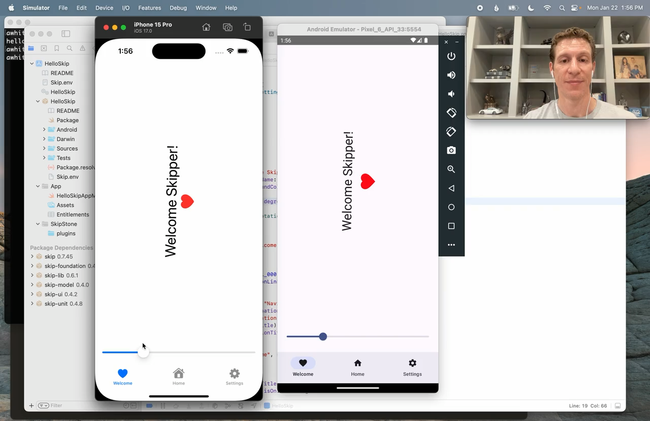
In our previous video, we explored the Skip Showcase app for demonstrating and exercising Skip’s SwiftUI support on Android.
You might want to watch that one first, because we’ll be exercising our new SwiftUI feature in the Showcase app in this one.
And what SwiftUI feature are we going to implement?
Well, we’re going to implement SwiftUI’s shadow modifier for placing a drop shadow on arbitrary content.
Whenever we’re working on Skip’s SwiftUI support, we know we’re going to want to exercise our new support in the Showcase app.
So let’s check out both SkipUI and the Showcase app source.
We could go to GitHub or source.skip.tools will take you to Skip’s repository listing.
Now let’s get SkipUI.
I’m going to come on that.
And the Showcase app.
Notice that we’re calling these as peers within the same directory.
This is going to help us in a second, because we’re going to work in an Xcode workspace.
Now, before I add these libraries to my workspace, I have to make a few changes, because I have a confession to make.
Skip already supports the shadow modifier.
We added it fairly recently, and I just thought it would make a good learning exercise for how to contribute to SkipUI.
So I need to go and make some changes to the source to remove that support, so that you can see what it’s like before you add support, and then the process of adding it.
So excuse the jump cut, please.
And we’re back.
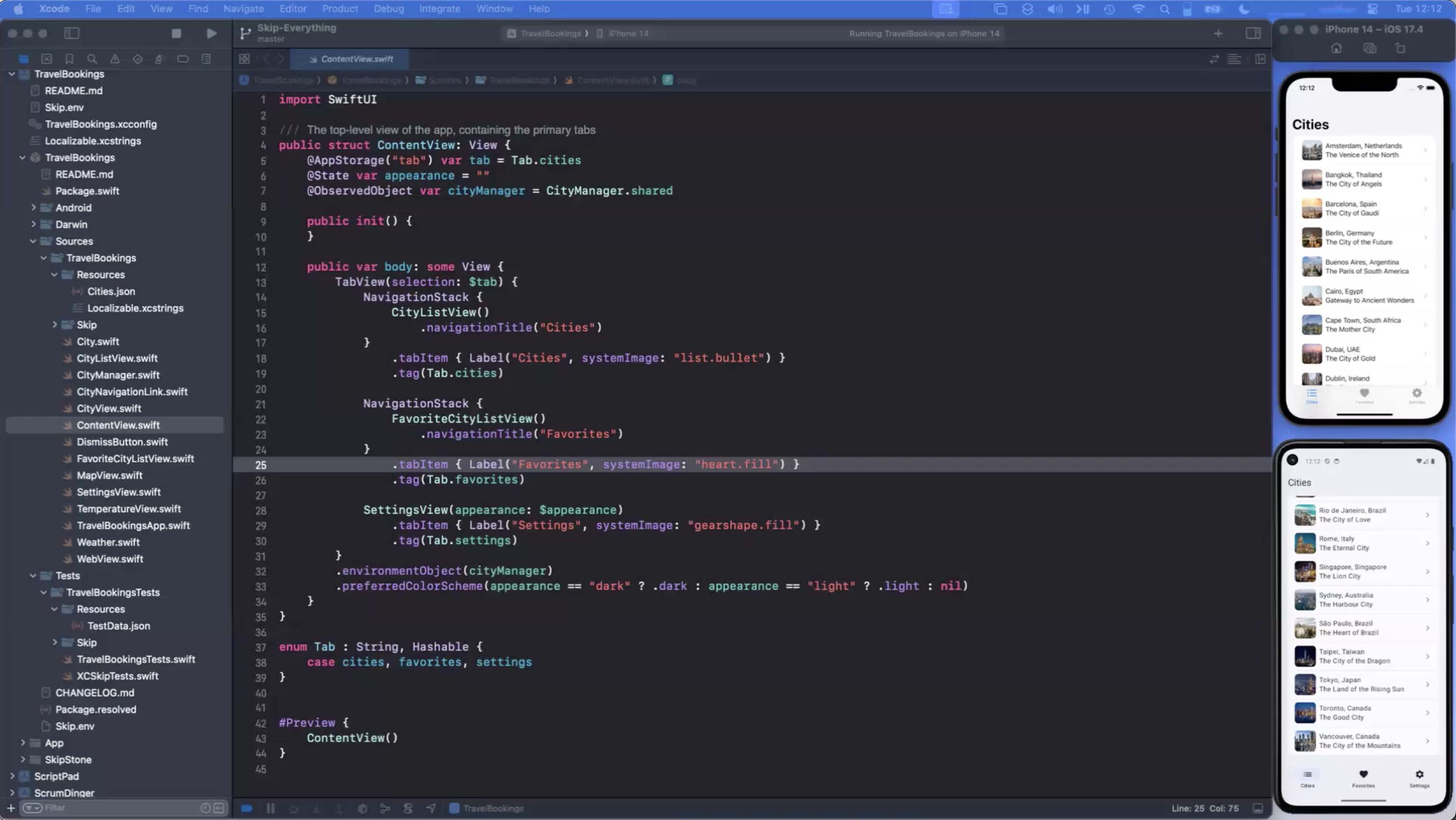
So let’s open Xcode and create our workspace.
We’ll call it Shadow.
And we’ll put it alongside our checked out source.
Now that we have our workspace, we can go ahead and add our packages.
In the library, we just add its module directory.
So we add SkipUI, and that will appear as a package.
For the application, we want to actually add the Xcode project.
So we can find that in the Darwin folder.
And the reason we’re creating a workspace is that Xcode, when it sees a module in the same workspace as your app, will use that module instead of the package.swift’s official definition.
So this allows us to work with SkipUI, and the most recent version will be reflected when we run the showcase app.
So when we’re developing UI components, we generally find it useful to have an app like Showcase to exercise them, possibly in combination with some sort of automated UI testing.
So now we’re ready to implement Shadow support in SkipUI.
Where do we start?
Well, I typically find it useful to start by building the playground in the Showcase app so I can see what I’m aiming for.
I can at least look at the iOS version and the results that I get from my tests in the playground, and then I know what I’m aiming for, and that gives me ideas for how to implement it on the Compose side.
So let’s start a build of the Showcase app.
Because this is a Skip app, of course, this build will run it on both the iPhone simulator and the Android emulator, which I already have running in the background.
Okay, our build succeeded.
Here it is in Android.
And it’s still attaching to the iOS version.
There it goes.
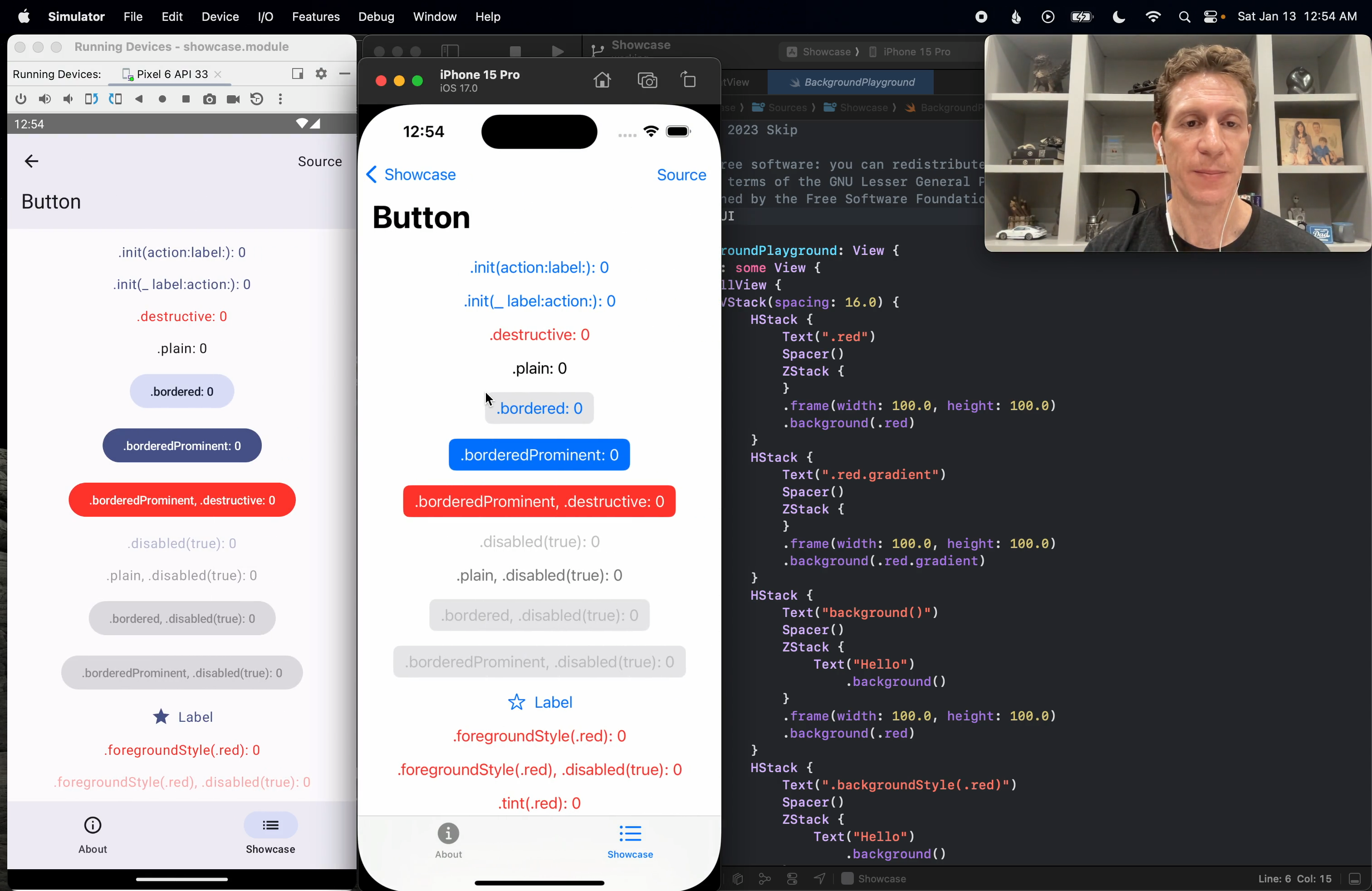
So we want to add an entry to this Showcase for shadows.
We’re going to structure it to look just like backgrounds, where we’ll describe some various shadow variations on the left, and we’ll show the results on the right.
Because we want it to look just like that playground, we might as well copy that playground source as our starting point.
We’ll call it “Shadow Playground,” and we’ll just structure it exactly like the background playground.
Okay, to start, we’ll just create a shadow with some radius.
We’ll do “primer.red,” and frame it, and give it a shadow.
That’ll be our first test, and we’ll add a few more.
I won’t make you watch me type, so I’ll be back in a second with a few more test cases.
Okay, I’ve added several more cases to my shadow playground, and I also decided to add a blue border around each one so we can verify that the shadow is not affecting the layout of the target view.
So we have a shadow with a 10-point radius.
We have another one that tests different shadow colors and offsets.
Another one that puts a shadow on a shape so we can see that it follows the outline.
Shadowed text, and then a shadowed control.
Now if you were to check the actual Showcase app and the shadow playground there, you’d see that we have several other tests as well in our visual playground, but I think this is good for the purposes of initial exploration.
So we’ve coded the shadow playground, but of course we haven’t hooked it up to the playground list yet.
So let’s do that.
The playground list just maintains a large enum of all of our playgrounds, and we’re just going to add the shadow there in alphabetical order.
So we’ll call this one “shadow.”
Each one knows its title, so let’s add the title.
And then finally we have the actual list and its navigation destinations.
The list itself is able to iterate through the enum cases, but we have to tell it where to go when it’s clicked. [typing sounds] Okay, that should be all it takes to hook it up.
Let’s run it.
Okay, and we received lots of errors.
Now if we think about it, this shouldn’t actually be a surprise because we haven’t implemented shadow yet.
But I wanted to show you the nature of some of the errors you might get.
These are actually fairly specific to working with SwiftUI.
What it’s telling us is actually two things.
First, we’re getting a warning that Skip is unable to match one of these API calls to determine whether it results in a view.
This is a SwiftUI-specific error that Skip will give.
Because Skip does have to do special code transformations when it transpiles SwiftUI into something that can call “compose,” it actually has to understand each API call you’re making.
Because if you’re calling a view builder, it has to do some special things.
So this is a warning saying, “Hey, I don’t know what’s going on anymore.”
And the reason we’re getting that is because we ran into this API that isn’t yet implemented.
So Skip kind of gets lost here, and it’s saying, “Hey, I don’t know from here on out whether these things are views or not.
I’m not going to be able to transform the code correctly.”
And what that does is, because it doesn’t know that .shadow returns a view, it also doesn’t understand that the parameter that we pass to border is a color.
So when we use this unqualified .blue constant, it doesn’t know what .blue is on.
It doesn’t know that that’s actually color.blue because it doesn’t understand the border function call.
So those are the errors we’re getting for each case in our playground.
Now to avoid things like this, what we typically try to do in Skip is stub out the entire API surface of whatever module that we’re trying to support.
And we will then at least mark the unimplemented APIs as unavailable in Swift, and that will give us a much better error message.
So let’s go ahead and do that now.
We’ll jump into the SkipUI code, and we’ll stub out .shadow.
So .shadow is a modifier.
Actually, let me not quick jump to it.
Let me actually show you where it is so you kind of get your bearings.
So in SkipUI, we go into Sources and expand that, and the SwiftUI API is divided into these directories here.
This is the entire SwiftUI API surface, and .shadow is a modifier, and it doesn’t pertain to anything else.
For example, button style modifier will typically be placed with the button code in Controls.
But because .shadow doesn’t really go along with anything else, and it’s a view modifier, it will probably just be in the view file.
Now I’m not going to go into the SkipUI internals here.
The readme for the SkipUI module on GitHub actually does a pretty good job of pointing you in the right direction if you want to learn more about the code base so that you can contribute intelligently.
It tells you which files are important, which files probably aren’t.
But as I said, modifiers are typically placed with view unless they pertain to something else specific.
And you can see that many of them are implemented, and you can use those implementations to inform your own implementations when you want to add support for something.
So you have a ton of samples to work with already here.
As you can see, things that we have not implemented yet are marked unavailable.
But .shadow, I intentionally unmarked it.
I intentionally took it out of the supported part of the code base, the stubbed part, and I moved it into an if-not skip block.
So these are sections that the skip transpiler skips completely.
And things that we have not even sort of started to port to skip, we typically place here.
So at the very end of some of these SwiftUI API files, you’ll see this big if-not skip block with things that we haven’t even begun to port yet.
Most things, however, are stubbed.
So let’s move the shadow modifier out of this sort of unported area and put it back into view and mark it as unsupported.
So as you can see, these seem to be alphabetized more or less.
So we’ll put it there.
We’ll mark it unavailable.
And now let’s try building again and see what happens.
Okay.
We got a much better error this time, right?
It highlights the line where we use shadow, and it says the API is not yet available in skip.
And it gives you instructions.
You can replace it in an if-not skip block to just bypass it for Android, and that will let you continue to use it for iOS and give you an uncompromised iOS experience.
But skip it for Android.
Android just simply won’t have the shadow.
It might be a slightly degraded user experience, but it allows you, again, to not compromise the iOS part.
Now let’s go ahead and do that now so you can see what it looks like and so that we can actually see what our shadow playground is supposed to look like.
Until now, we still haven’t seen what the result of this code is.
So again, I won’t make you watch me type.
I’ll go ahead and do that, and I’ll see you in a second.
Okay, I’m back.
You can see that I’ve added if-not-skip compiler directives around each use of our shadow, which should now allow us to compile it for Android, even though it’s marked unavailable in skip UI.
Now this technique you can use anytime you want to exclude code from your Android transpilation or your Android build.
And you can also, of course, use if-skip blocks without the not sign to create code that’s only transpiled to Android, and that allows you to call Java and Kotlin API directly from Swift if you like.
You can read more about that in our documentation.
Let’s run one more time, and this time the errors disappear and we should get a good build.
Okay, and it’s coming up.
There it is on the iPhone simulator, and there it is on Android.
So now we should be able to see our shadow playground, and there it is.
I can see that on iOS we do have the expected shadows.
We’re testing a larger radius here.
Here’s a color with an offset.
See that the shadow actually does hug to a certain shape and a text, and that when you use it on a control, all the non-transparent pixels are shadowed.
The shadow playground should also be here on Android.
It is, but no shadows, and that’s because, of course, we excluded that shadow modifier from the build.
So now that we see what our target is on the iOS simulator, we can start to think about our implementation strategy and get to work.
First I’ll point out, though, that simply moving the shadow modifier into the unimplemented and marked unavailable state produced much better error messages.
So that fix alone would make for a much better experience for our users, and that would be a great contribution if you ever wanted to make a fix like that to SkipUI.
I wanted to also note that the Xcode build errors were all inline in Xcode and on the correct lines.
So Skip strives to do that with any kind of code error that you receive, whether it’s from Skip itself, whether it’s from the Kotlin compiler.
You should always get those lines reverse mapped.
Typically if it’s a Kotlin compiler error, you’ll also get a link to the transpiled Kotlin file, so you could go jump straight to the Kotlin file from the Xcode error and see what the transpilation error was.
In this case, these weren’t Kotlin compiler errors, these were errors from Skip itself.
OK, so let’s jump back into the SkipUI view source code and start filling in the shadow modifier.
Now you may have already noticed that SkipUI itself is transpiled.
It’s written in Swift, and it uses if-skip-blocks, which I recently referred to, to execute and call compose.
Now we could simply surround pretty much the entire codebase in if-skip-blocks, but instead we’ve chosen to leave each API exposed to the Swift compiler, and we want to make sure that SkipUI itself still is able to compile as a Swift module.
What it lets us do is, when we make changes to one aspect of the codebase, it lets us see how those changes might fan out and affect other places within SwiftUI.
So we know this way, by keeping it compiling in Swift, that any API changes we’re making for the sake of getting it to execute on top of compose are compatible with the rest of the module.
So we don’t actually care what’s in the else portion of these blocks.
Any modifier can just return self, just return the original view.
It’s never executed, it’s just there to keep things compiling.
What we care about is what’s in the if-skip-block, because that’s what’s going to get translated into Kotlin, and that’s what needs to call our compose.
Now, pretty much all of our modifiers use what’s called the compose modifier view.
That has a few constructors.
You may have noticed, if you’re eagle-eyed, that it also can have subclasses, like tag modifier view down there.
But it has a few constructors.
And they’re used for different tasks.
What we’re going to want is the first one here that allows us to specify a content view, and then takes a block that allows us to take over the composition of the target view.
If you’ve never thought about how SwiftUI does modifiers, I think we do it similarly, although I am not privy to the SwiftUI internals, in that when you have a target view that’s modified, what we do is basically wrap it in this compose modifier view.
So you end up with this sort of shell game, this series of wrapper views, each of which can affect the rendering of the target view in some way, and they can build on each other.
So content view itself, that’s the viewer modifier.
And we supply a block that’s going to do something.
So for now, let’s just stub this out, and just render the target view as is.
So all we’ve done here is remove the unavailable, and created this compose modifier view, but at this moment it’s not actually modifying anything.
It’s just composing the initial target view.
But that should allow us to remove all these if not skip blocks from our playground.
So I’m going to go ahead and do that, and check back with you.
Okay, I’ve removed the if not skip blocks.
We’re going to run this again, and this time it should run on Android.
Okay, and it’s coming up.
Now we won’t see a change because we didn’t affect the iOS code.
And on the Android side, while we removed the unavailable and the if not skip blocks, we still haven’t actually implemented the shadow.
We’re just rendering the original view in our modifier, but we can at least see that that’s working as expected.
Okay, so now for our real drop shadow implementation.
Now as I mentioned, I’ve already done this, and I can tell you that when I initially did this, I wasn’t sure how I was going to implement it.
So I googled around a bit.
I found bits and pieces of solutions to different problems that I thought I could apply here, but of course because I’m googling for composed solutions to things, all the sample code I was seeing was in Kotlin.
So what I decided to do was actually add a Kotlin file to skipUI.
We can do that right in the skip directory.
So you can see that while most of skipUI is implemented in Swift and transpiled, as I mentioned, we do use Kotlin files here and there.
So I’m going to create a new file.
Just an empty file.
I’ll call it shadow.kt.
Now this is actually exactly the type of situation where you may want to code in Android Studio instead of in Xcode, and there’s a couple reasons for that.
Now one is that we’re going to be implementing it in a Kotlin file, and Android Studio is obviously going to be way better for that.
We’re going to get better syntax highlighting, code completion, automatic imports, etc.
Now two is that the build and run cycle is way faster in Android Studio when you can ignore the iOS side of the build.
So working in Android Studio can be way faster when you’re iterating over and over, experimenting, trying to find the right solution to something.
In fact, sometimes I’ll even work in Android Studio when my goal is to have the end solution be in transpiled Swift.
I’ll stub out the solution in Swift, move to Android Studio, edit the transpiled files to fill out the stubs, knowing that I’m going to have to backport the solution to Swift, but sometimes it’s still faster to do it that way just because I get to iterate over and over and take advantage of Android Studio’s niceties like the code completion and automatic imports in the meantime.
Now typically to open your app in Android Studio, you go to the application, you open its Android folder, ctrl-click settings.gradle, and go to Open with External Editor, and that will open it in Android Studio.
However, because we want to edit a local copy of one of the skip libraries, in this case, skipUI, we have some special considerations.
Normally, if you open with External Editor here, open your app in Android Studio this way, Android Studio is going to use, again, not your local copy of skipUI or whatever libraries you have checked out in your workspace because it doesn’t know about the workspace.
It’s going to use the version that’s specified in your package.swift.
So we have to make some edits to this settings.gradle file to point Android Studio at the Xcode build version. [typing] So the file itself tells you how to do this.
It has some explanations here.
Here it is, actually.
And so what we’re doing is instead of setting the build products directory to the environment, we’re actually going to point it at our derived data build that Xcode has made. [typing] So let’s do that, build products directory.
Now in order to find our derived data, we can open Xcode’s settings, ask it to open the derived data folder, and from there look for our workspace name.
Here it is, shadow.
Go into the build and products and the iPhone simulator debug directory.
Drag that back into Xcode and it will copy the path for us.
Now we can open in Android Studio, but before we do, we should also clear Android Studio’s or actually it’s the Swift command line build dot build directory.
This is sort of the equivalent of its derived data.
It’s good to clear this whenever you switch the build products directory or else Android Studio has a tendency to get confused.
It’s working off of cached versions that are different from the versions it should be looking at.
So…
Go into our skip app showcase and we just want to get rid of that dot build folder.
There we go.
Back to Xcode, open with external editor.
We’ll wait for Gradle to sync.
And there we go.
So now we should be able to run this right from Android Studio.
And the first build takes quite a bit of time because it’s doing a fresh build.
Remember we deleted its equivalent of derived data.
And the build was successful.
And it has come up in the emulator.
Of course it’s not going to look any different.
But it’s good to see that it’s all working.
So now we can iterate on our common file right from the comfort of Android Studio. [typing sounds] You can see that Android Studio gives us inline errors, automatic imports, code completions and everything else you would expect.
We’re going to have a context, the shadow color.
Now we’re fully qualifying this one because we have a local color in SwiftUI that otherwise would shadow it.
Color we have an offsetX, offsetY, and a radius.
And then finally we have a closure that takes a context and composes the content.
And let’s tell it to import dp.
Okay.
And for now, let’s just invoke the content closure.
Again, this won’t actually render any shadow but we can again see the original content.
So we can go to Xcode, go back to View.
And here, rather than just composing the view, we can call our new function.
Shadow, and give it the context.
The color, and we want to pass it the colorImpl which is the underlying composed version of color.
Again, the details of the implementation are not important.
They’re things you would learn as you sort of get familiar with the code base.
Now our composed modifier view is actually rendering using the shadow function that we’re creating in Android Studio.
And we can go back to Android Studio and fill in the implementation.
I’ll do that now and show you it in a second.
And I’m back with the final solution.
Now we won’t go through it line by line but it’s actually pretty interesting.
It took me a lot of iteration, a lot of trying out various things in Kotlin and Compose using the power of Android Studio.
And what I got is pretty cool.
The general idea is that we draw our content twice.
We draw it once as its own shadow.
So we apply a custom color matrix which is defined down here where we remove the original RGB from the content as we draw it.
And instead we substitute the given shadow color RGB and then we multiply the alphas.
So we use that color matrix to draw the content.
That turns it into its own shadow sort of.
We also apply a blur during that drawing.
And we position it down here using a custom layout at the correct desired offset of the shadow.
And then we draw it again, this time, with all its original color, etc. as the content itself over the shadow.
And that’s the general outline of the solution.
So pretty cool stuff.
Just interesting that you can even do that sort of thing in Compose.
If we look at it, there’s the iOS simulator.
Let’s do this in that order.
We’ve got both simulators up.
You might remember what it looked like in the iOS simulator.
And now let’s see what the results look like in the Android simulator.
You can see that minus changes in the size of things because of the different scaling going on with the two simulators.
We have equivalent results now.
We have this sort of light, very blurred shadow in the first example.
We have a colored and offset shadow in the second.
We have the shadow that can mirror whatever shape you give it, whether it’s a circle or text.
And when you give it something complicated like a control, it has no problem with it.
It takes every non-transparent pixel and applies the requested shadow.
So now all that would be left to do would be to submit a PR to the Skip UI and to the Skip app showcase modules so that we could incorporate it into Skip and so that all Skip users could enjoy your implementation.
So I hope you found this informative.
Implementing SwiftUI features on top of Compose for Skip, I find really interesting and fun.
I find that I learn a lot about SwiftUI, and I find I learn a lot about Compose while doing it.
So that’s all for today, and I hope to see you in the next one.
Related Videos
This is a quick overview of the Skip tool and a demonstration of how it can be used to build and run native apps on both iOS and Android.
This video demonstrates using a Skip shared Swift model layer to power separate iOS and Android apps.
This is a brief introduction to the Skip tool and how it integrates with the Xcode development workflow for building dual-platform apps for the iPhone and Android.
This video demonstrates getting started with using Skip. It walks through installing Skip and creating your first dual-platform app. Follow along with the video and you will have your own SwiftUI app running side-by-side on the iOS Simulator and Android emulator.
Scrumdinger is Apple’s canonical SwiftUI iPhone app. In this video, we’ll use Skip to run Scrumdinger as a native Android app as well. Learn the steps to bring an existing iOS codebase to Android.
Explore the Skip Showcase app demonstrating and exercising Skip’s support for various SwiftUI components on Android. Learn what your SwiftUI interfaces will look like when represented by Jetpack Compose views on Android devices.
This is a recording of Skip’s May 7, 2024 webinar. The webinar describes the current mobile development landscape, discusses how Skip fits in, and features code samples, live demonstrations, and some Q&A.